12 Creative Ways to Make a Small Entryway Look Bigger (without Knocking Down Walls)
We’ve all been there: you open the door, and boom—your entryway is basically a doormat with dreams. Good news: you don’t need more square footage to make it feel bigger.
You just need a few smart tricks that add light, height, and hidden storage. Ready to give that tiny foyer main-character energy?
1. Max Out Vertical Space Like You Mean It
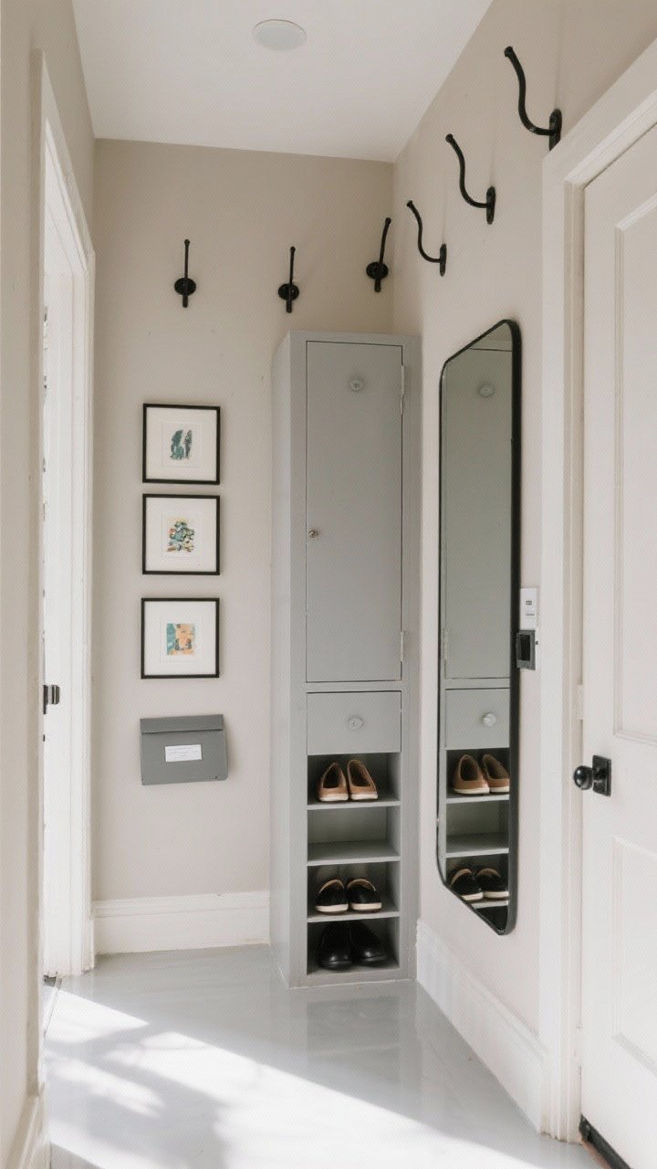
When floor space is scarce, go up. Your walls are prime real estate for storage, style, and illusion.
Why it works
Vertical lines pull the eye upward, creating a sense of height and airiness. Bonus: you keep the floor clear, which instantly feels less cramped.
- Install tall hooks or a peg rail at 68–72 inches—high enough for coats without looking cluttered.
- Add a narrow vertical cabinet or locker-style unit for shoes, umbrellas, and mail.
- Stack art in a vertical gallery (3–5 pieces) to elongate the wall and add personality.
- Use a floor-to-ceiling mirror or a tall leaning mirror to stretch the space visually.
Quick tip: match hardware finishes (black, brass, nickel) for a cohesive, less-busy look.
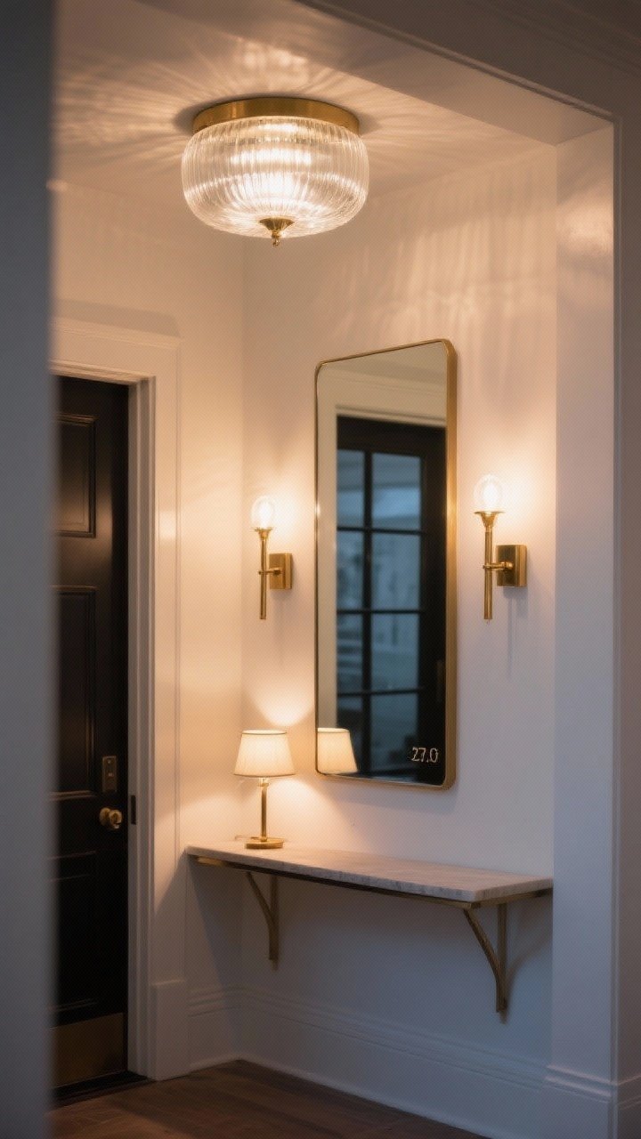
2. Light It Like a Boutique, Not a Hallway
Lighting can make or break small spaces. Most entryways suffer from sad ceiling bulbs and shadows.
Layer your lighting
- Overhead: Swap the builder-grade flush mount for a glass or semi-flush fixture that spreads light.
- Wall: Slim sconces add glow without eating floor space. Picture lights over mirrors = chef’s kiss.
- Accent: A tiny lamp on a narrow console feels cozy and luxe.
Use bulbs in the 2700K–3000K range for warm, welcoming light. FYI, dimmers are magic in tight spaces.
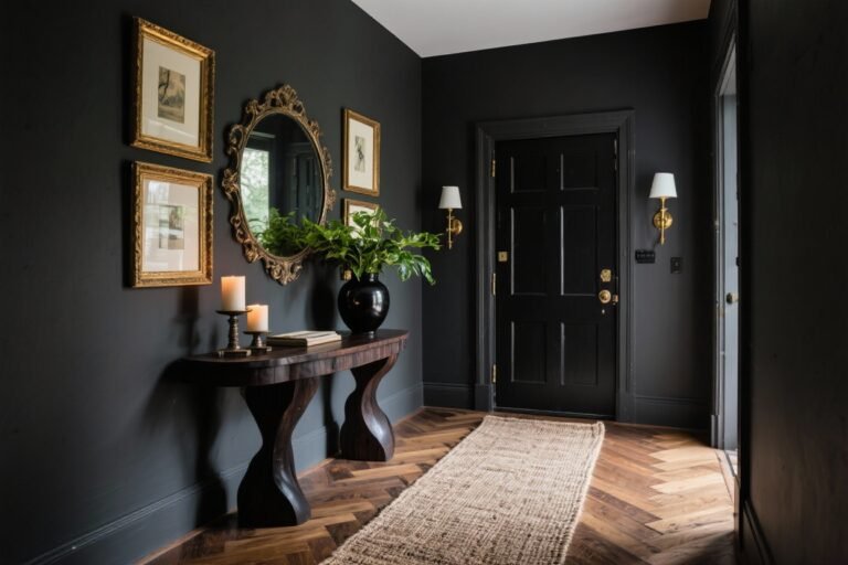
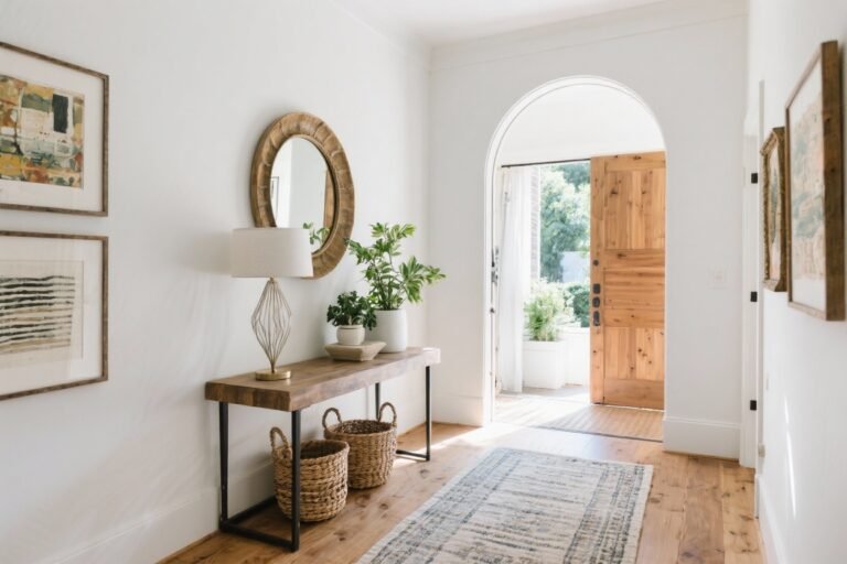
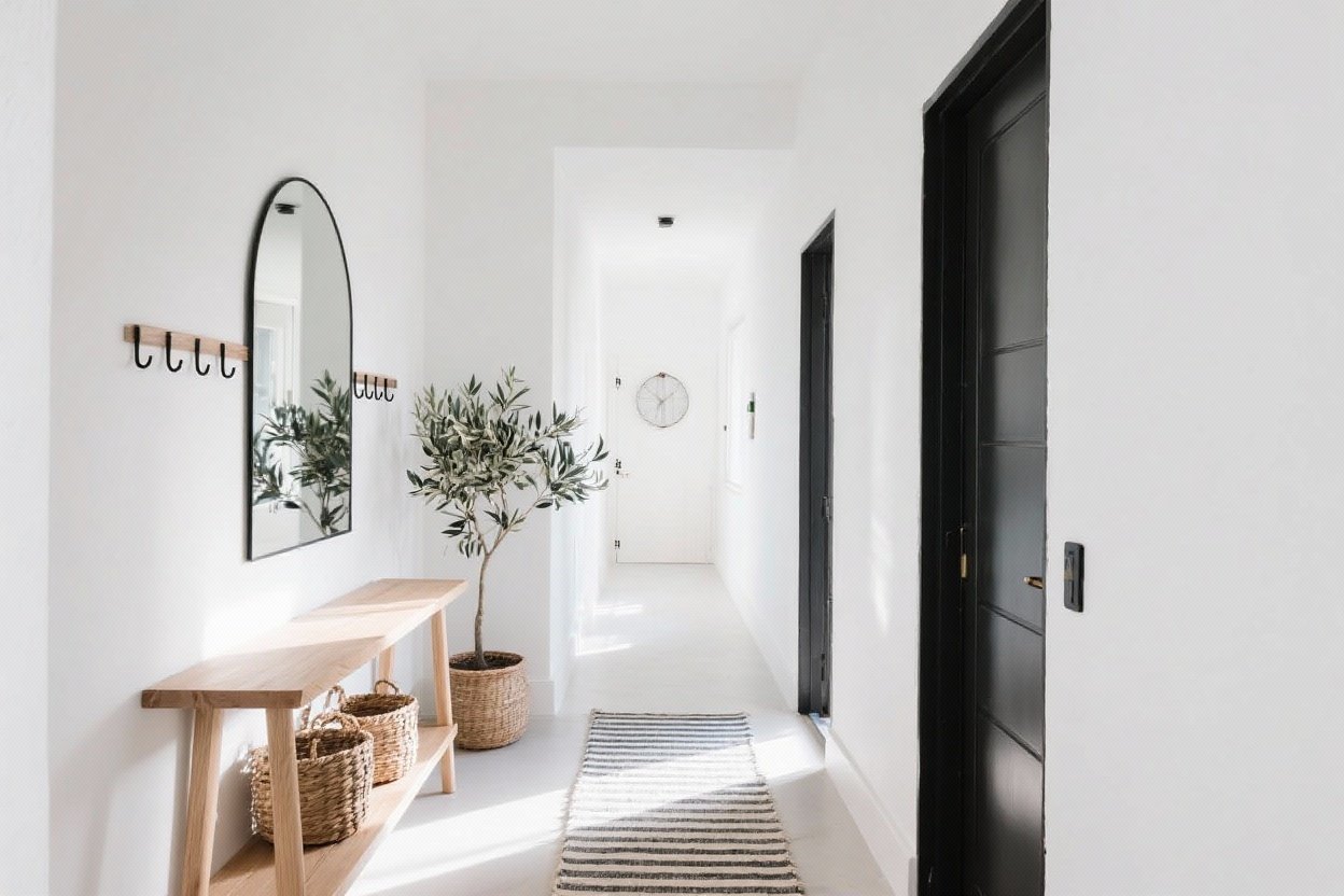
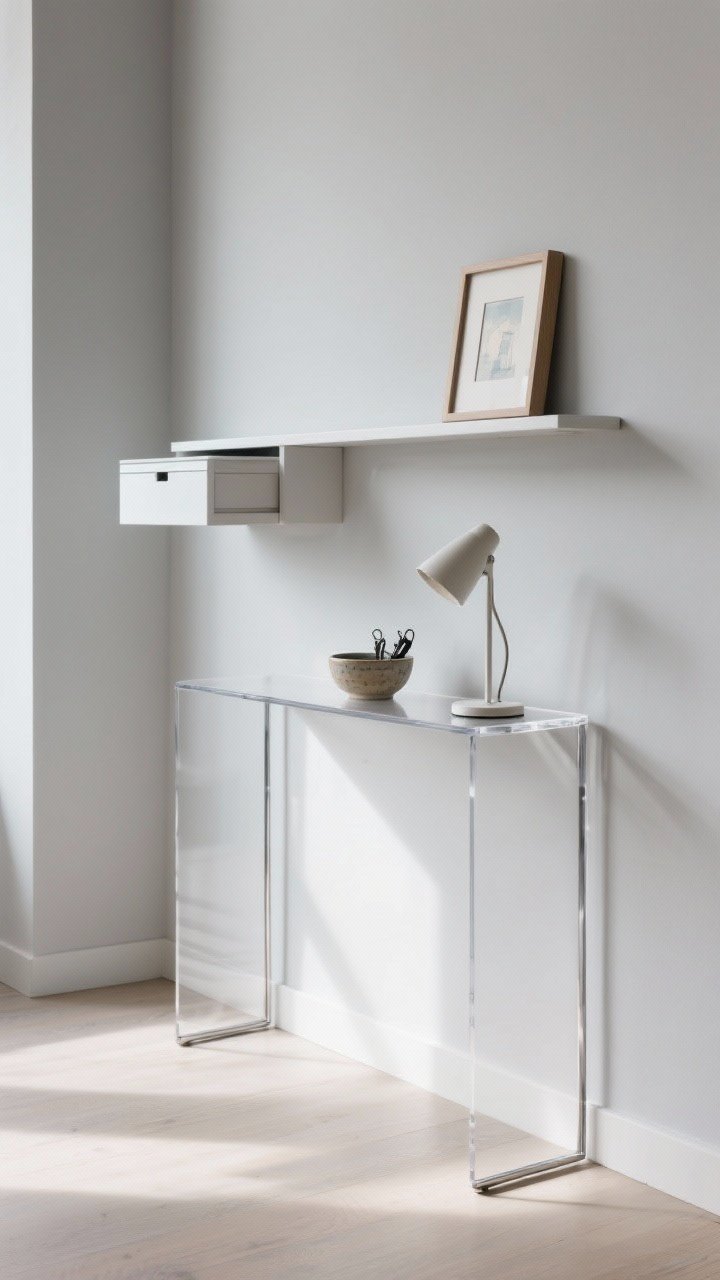
3. Choose a Console That’s Skinny, Smart, and Sneaky
You want the function of a landing spot without the bulk. Think narrow, airy, and multipurpose.
- Go slim: Aim for 8–12 inches deep. Acrylic or open metal frames feel light and modern.
- Try wall-mounted shelves: A floating ledge can replace a full console and leave floor space open.
- Use hidden storage: A drawer for keys and sunglasses keeps surfaces clutter-free (aka bigger-looking).
Style it with a small bowl, a tiny lamp, and one framed piece. That’s it. Clutter kills the vibe fast.
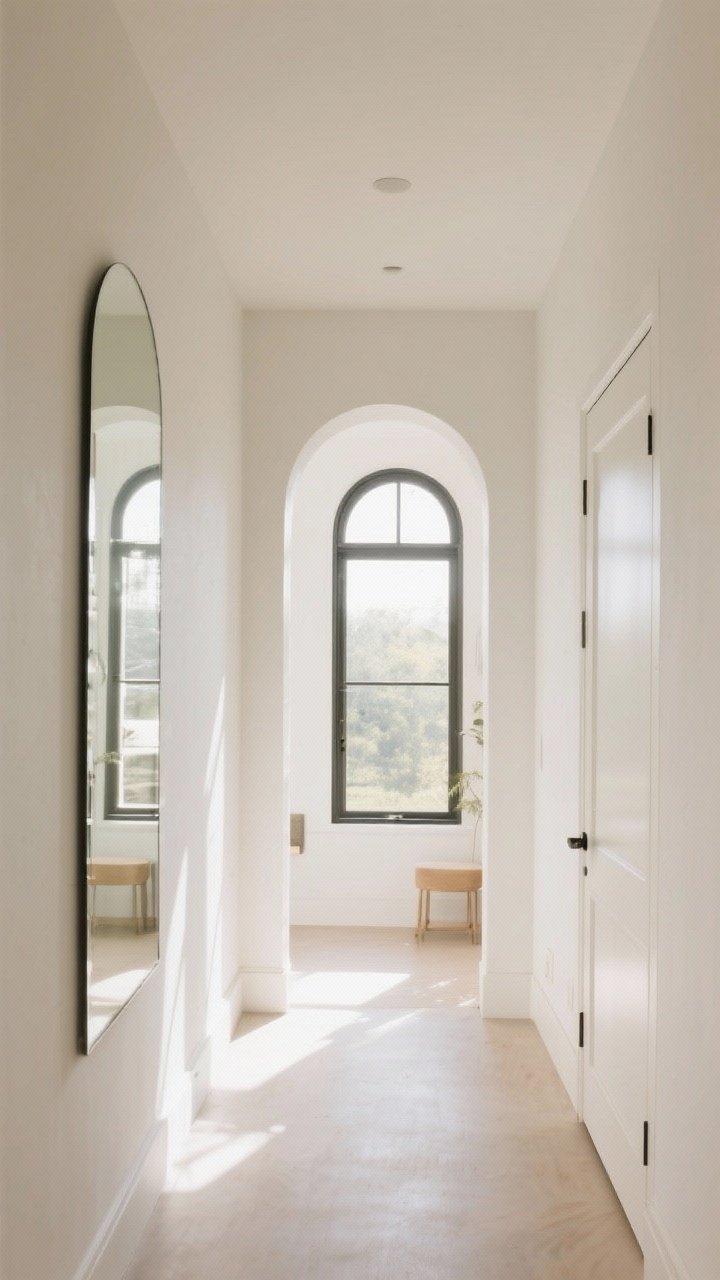
4. Mirror Magic (But Do It Right)
Yes, mirrors make spaces feel bigger. But the trick is placement and scale.
- Go large: Bigger mirrors double the light and visually widen the room.
- Opposite light: Place mirrors across from windows or light fixtures to bounce brightness.
- Shape matters: Arched mirrors soften sharp corners; long rectangular mirrors elongate walls.
Pro move: mirror a closet door with a clean edge-to-edge panel. It looks custom and reflects the whole entry.
5. Paint Tricks That Stretch the Space
Color can compress or expand a room. Let’s use it to your advantage.
Color strategies
- Monochrome magic: Paint walls, trim, and doors the same color for a seamless, bigger feel.
- Light and bright: Soft whites, gentle grays, or pale greiges reflect light without feeling cold.
- High-contrast front door: A slightly darker interior door adds depth without crowding.
- Ceiling lift: Paint the ceiling the same color as the walls or one shade lighter to “erase” edges.
Keep finishes consistent (matte or eggshell) to avoid visual noise. High-gloss on doors can be a fun moment, though.
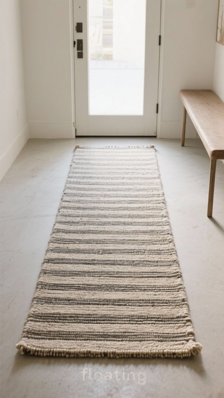
6. Rugs That Trick the Eye (And Catch the Dirt)
A good rug grounds the entry and can make it feel longer or wider. Just pick your pattern wisely.
- Runner over doormat: A longer runner pulls the eye forward, making the space feel deeper.
- Go big: If using a flatweave, size up so furniture sits on it—floating pieces look messy.
- Directional stripes: Stripes parallel to the longest wall stretch the room visually.
- Low profile: Flatweave or indoor/outdoor materials keep doors from catching.
Pattern tip: small spaces love medium-scale patterns that hide dirt without overwhelming.
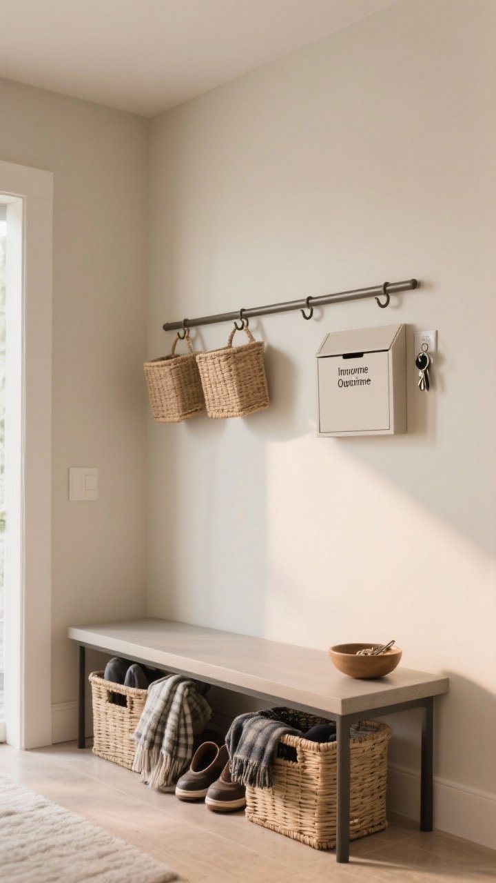
7. Declutter Like a Minimalist, Store Like a Maximalist
Real talk: the entry is where clutter breeds. The secret to a spacious vibe? Ruthless editing plus smart storage.
Build a drop zone
- One hook per person: Prevents coat pileups. Double hooks for bags and hats.
- Closed baskets: Hide shoes, scarves, and random “I’ll deal with it later” items.
- Mail system: Wall-mounted trays labeled “Incoming” and “Outgoing” keep surfaces clean.
- Key solution: A small bowl or hidden magnet strip—no more key hunts.
Once a week, do a 5-minute reset. You’ll be amazed how much bigger it feels when it’s not a chaos zone.
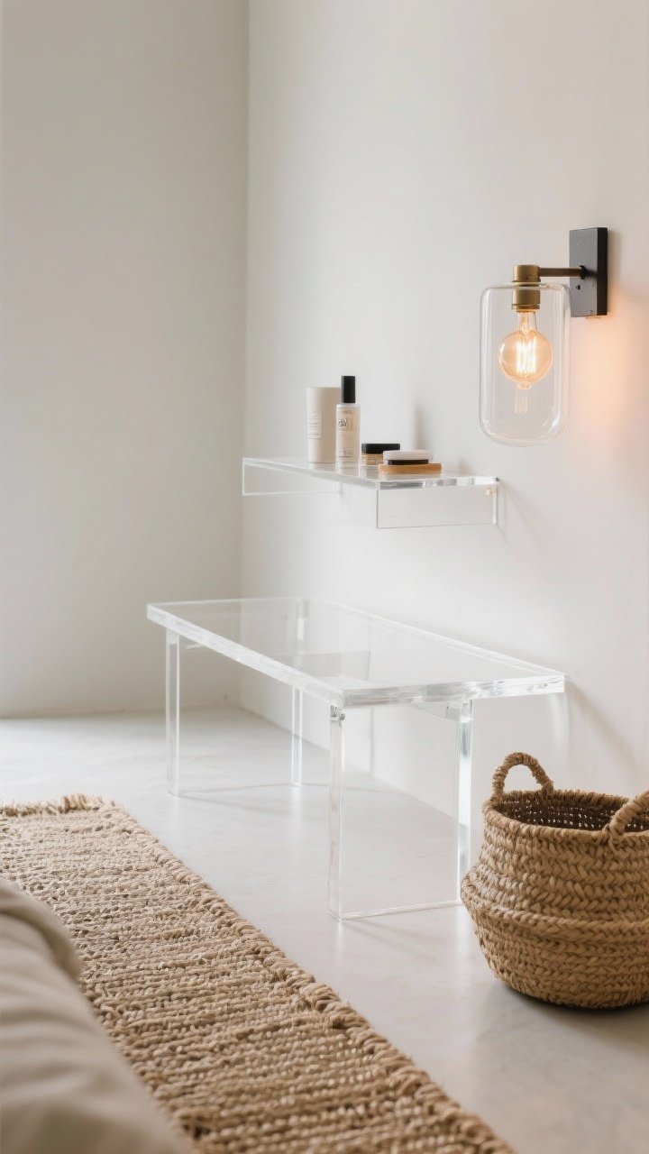
8. Glass, Lucite, and Anything See-Through
Want furniture without the bulk? Choose transparent or open designs so your eye keeps moving.
- Acrylic console or shelf: Function, but visually weightless.
- Open-leg benches: Air flows, light passes, space expands. Science!
- Glass sconces and light fixtures: No heavy shades to block the glow.
Pair with a textured runner or woven baskets so it doesn’t feel too slick. It’s all about balance, IMO.
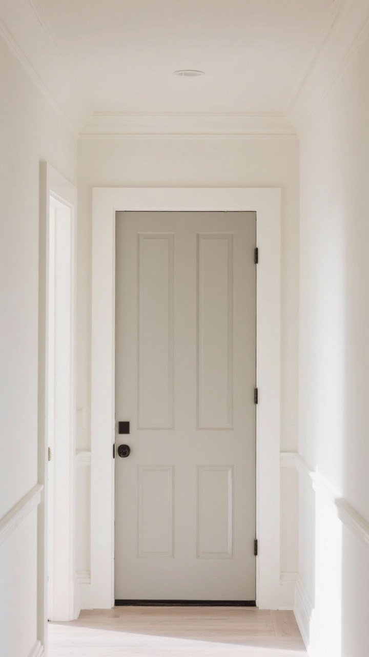
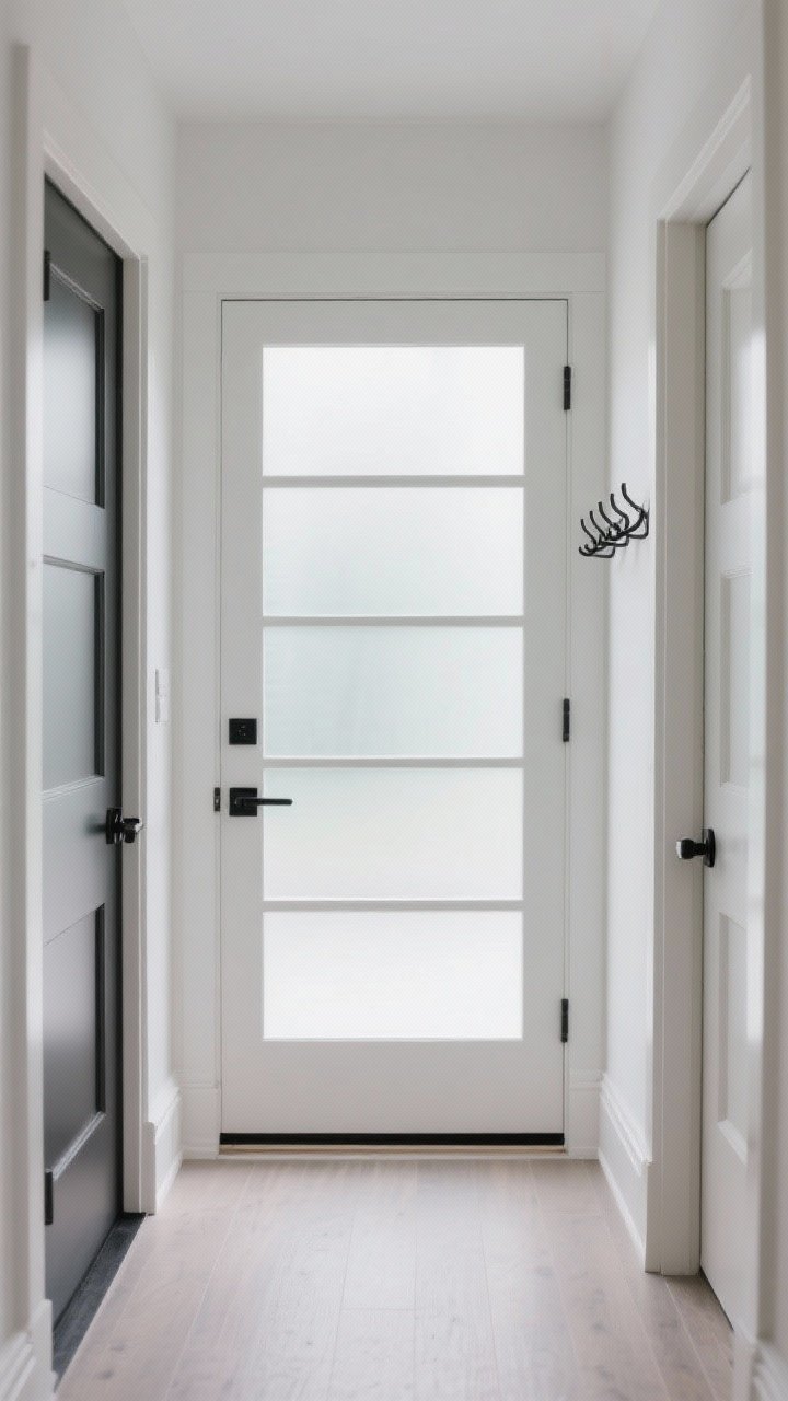
9. Doors and Sightlines: Clear the Path
Entryways feel bigger when your eyes get a clean, uninterrupted view into the rest of your home.
Small changes, big results
- Swap solid doors for glass panels (frosted for privacy) to let light flow through.
- Use low-profile hardware and keep it consistent to reduce visual clutter.
- Mount the coat rack behind the door swing if clearance allows—out of sight, out of mind.
- Keep baseboards and thresholds simple so your eye isn’t stopping at every trim change.
If you’ve got a small closet, consider removing the door and adding a curtain in a tonal fabric. Way less clunky.
10. Style With Big, Bold Moments (Just Fewer of Them)
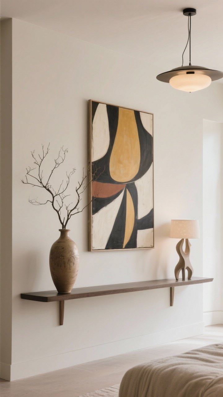
Counterintuitive but true: larger, simplified decor often makes a small entry look more spacious than lots of tiny pieces.
- One oversized art piece beats a dozen small frames. It reads cleaner.
- A single tall vase with branches adds height and drama without crowding.
- Statement lighting draws the eye up and sets the tone for the whole house.
Think fewer, bigger, better. Visual clutter makes spaces shrink fast.
11. Use Texture and Tone-on-Tone Layers
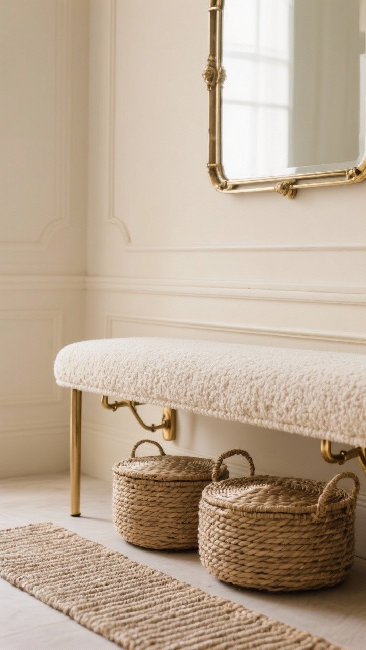
Texture brings depth without chaos. And tone-on-tone palettes make the space feel calm and cohesive.
How to layer smart
- Neutral base: Walls, trim, and large pieces in similar hues (beige on beige, gray on gray).
- Textured accents: Woven baskets, boucle bench, ribbed runner—tactile without busy patterns.
- Metal accents: Keep to one finish for hooks, frames, and lighting. It reads polished.
Want a little color? Add it with a pillow or art—but keep the backdrop unified so the room “breathes.”
12. Build a Micro-Mudroom With Zoning
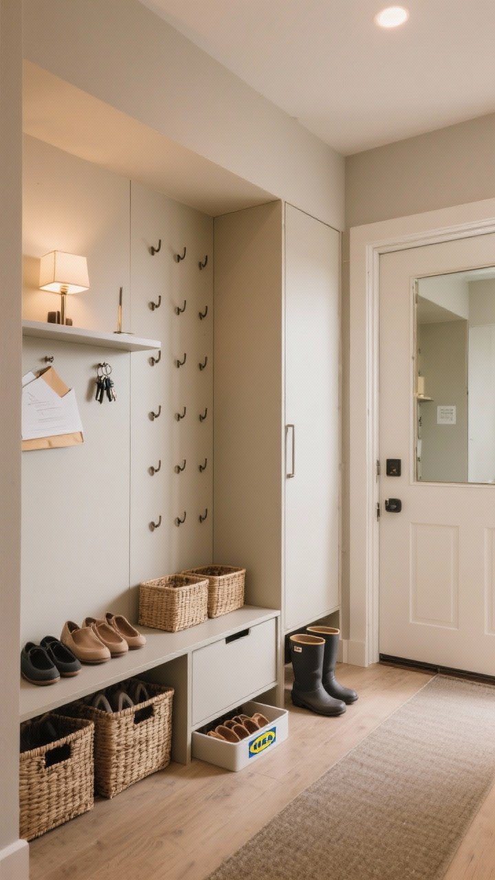
No dedicated mudroom? Join the club. You can still create zones that make your entry work harder and feel larger.
Divide and conquer
- Zone 1: Drop Spot – A narrow console or floating shelf for keys, mail, and a small lamp.
- Zone 2: Coat & Bag – A vertical row of hooks or a slim wardrobe cabinet.
- Zone 3: Shoes – Closed baskets or a shallow shoe cabinet (hello, IKEA Besta/Hemnes).
- Zone 4: Mirror – Full-length if possible for last looks and light bounce.
Use a single rug to connect the zones so it feels intentional, not pieced together. Add a small tray for wet boots in winter—practical and tidy.
Quick Reference: Do’s and Don’ts
- Do: Layer lighting, keep surfaces clear, use tall elements, and choose transparent or open-leg pieces.
- Do: Go monochrome or tone-on-tone for walls, trim, and doors to smooth visual lines.
- Don’t: Crowd the entry with tiny decor, busy patterns, or bulky closed-off furniture.
- Don’t: Ignore the ceiling—height illusions are your best friend.
Sample Layout Ideas
- Super Narrow Entry: Floating shelf + vertical mirror + row of hooks + runner with lengthwise stripes.
- Square Entry: Round mirror + semi-flush light + open-leg bench with baskets beneath + oversized art.
- Entry With Closet: Mirror the closet door + slim console opposite + sconce lighting + tonal paint.
Remember, the goal isn’t to stuff more into your entry—it’s to make every piece earn its place. A little editing and a few strategic swaps can transform that tiny pass-through into a welcoming, spacious moment. FYI, your future self will thank you every time you walk in the door.
You don’t need more space—you just need smarter space. Now go give that entry the glow-up it deserves.