10 Above the Kitchen Cabinet Decor Ideas You’ll Wish You Tried Sooner
That awkward gap above your kitchen cabinets? It’s not just a dust collector. It’s prime real estate for style, storage, and a little personality.
If yours is sitting empty (or holding random cereal boxes—no judgment), let’s turn it into the chic display your kitchen deserves.
1. Build A Breezy Greenery Moment
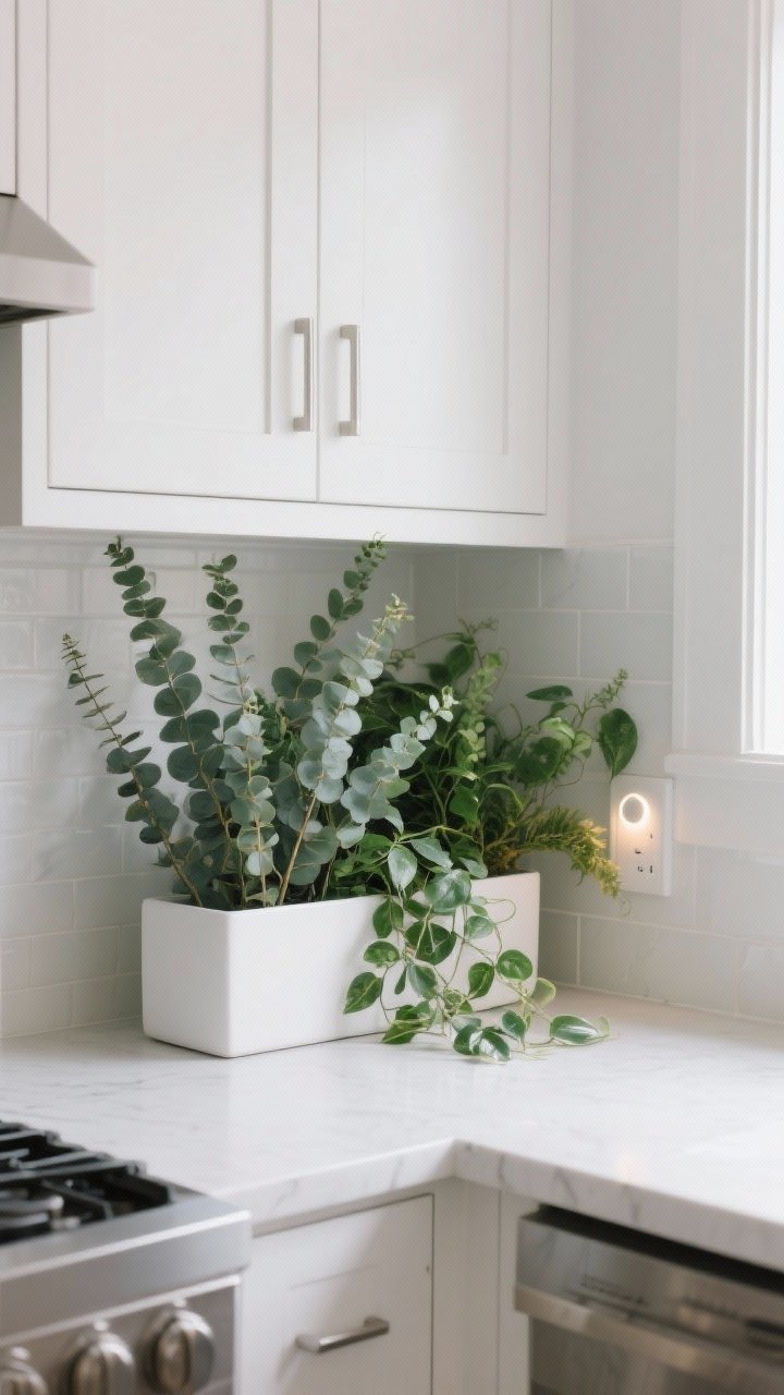
Nothing softens hard cabinet lines like a lush layer of green. A mix of trailing vines and upright plants makes that top zone feel intentional and alive. Fake plants are totally fair game if your kitchen lacks light—no one’s climbing up there to check the soil.
How to pull it off
- Mix heights: Combine tall faux eucalyptus stems with trailing pothos or ivy for movement.
- Use long planters: Slim, rectangular planters create a clean line and keep pots from tipping.
- Keep it dust-friendly: Choose plants with smoother leaves you can wipe down.
Pro tip: Tuck a battery-powered puck light behind the greenery to add a subtle glow at night. Instant ambiance.
2. Style With Oversized Art (Yes, Really)
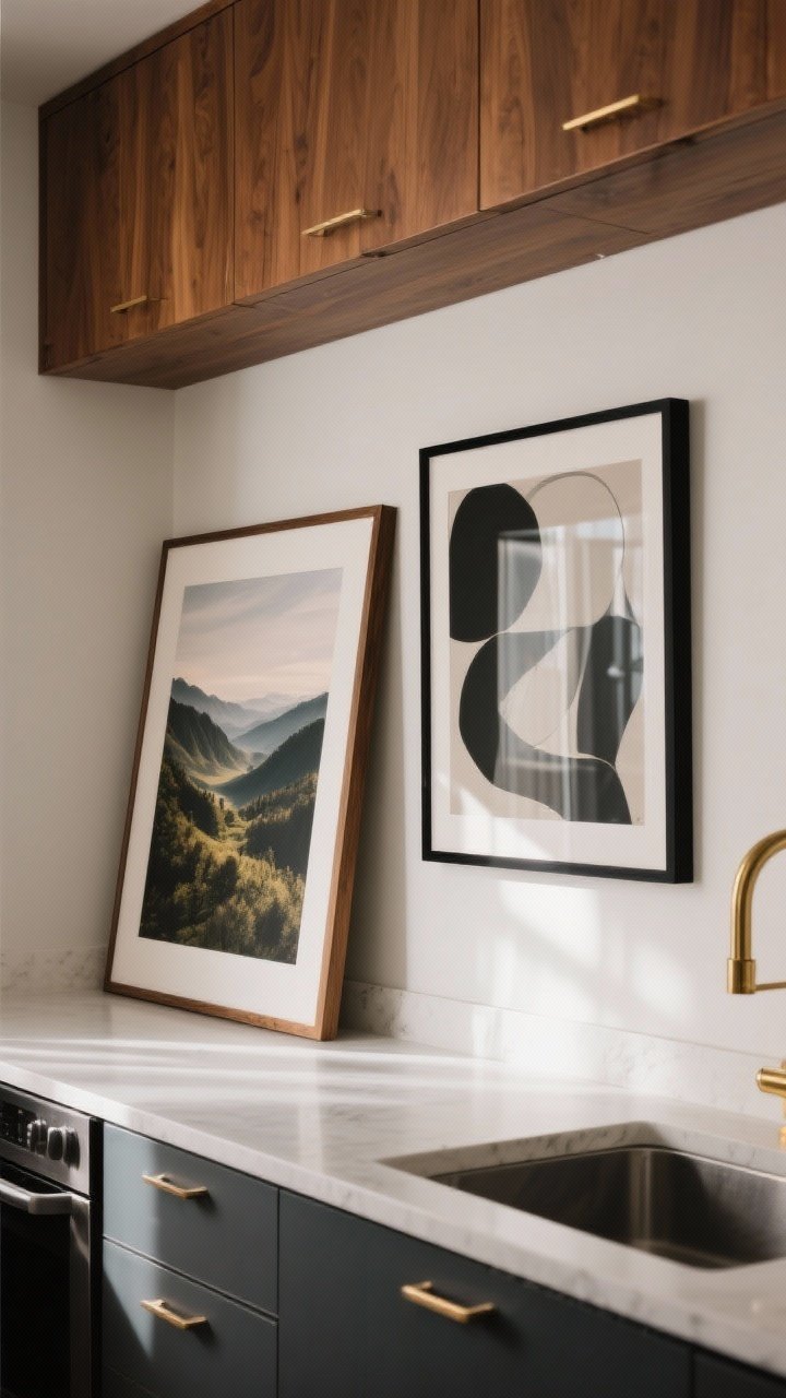
Large artwork feels bold and curated—like your cabinets are framing a mini gallery. Landscapes, abstracts, or vintage portraits instantly add mood without cluttering the counters.
How to pull it off
- Go big or go home: Choose pieces that fill the vertical space so they don’t look like afterthoughts.
- Lean, don’t hang: Lean art against the wall for that effortless, layered look.
- Stick to 1–3 pieces: Create a focal point instead of a busy collage.
FYI: Framed canvas or acrylic prints handle kitchen humidity better than delicate paper.
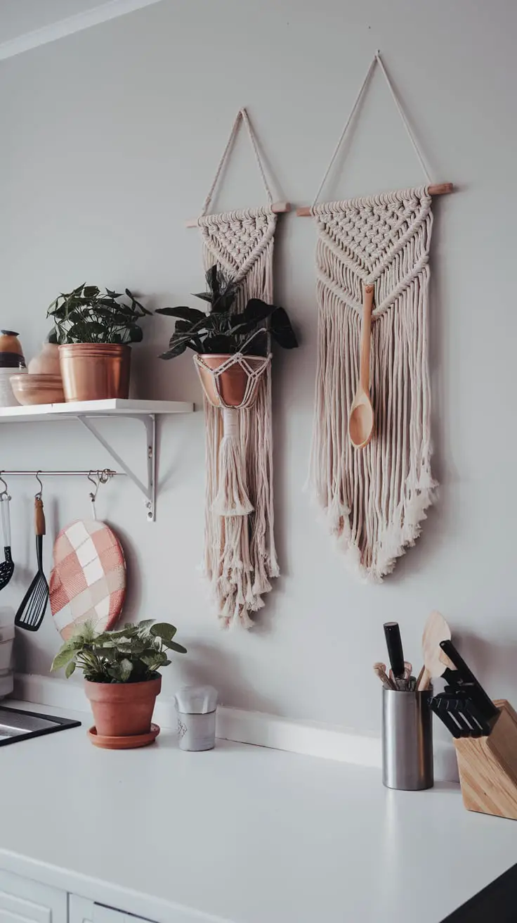
3. Corral Pretty Things On Trays And Baskets
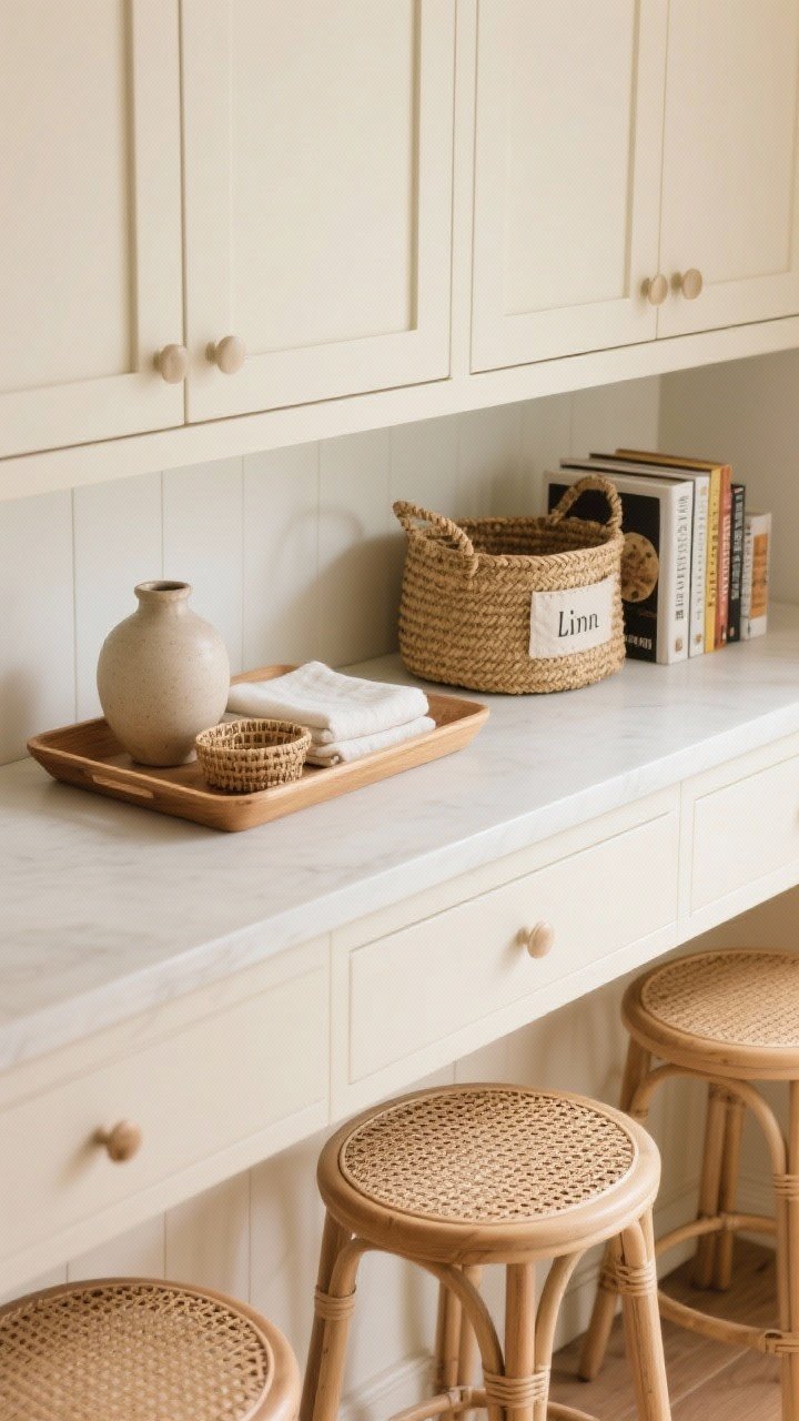
Want it to look styled—not scattered? Group decor on trays or in woven baskets. It reads cohesive and makes cleaning easy. Plus, baskets add texture and hide not-so-pretty essentials. We love a multi-tasker.
How to pull it off
- Choose sturdy bases: Wood trays, seagrass baskets, or metal risers keep items contained.
- Use the rule of three: A basket, a vase, and a stack of cookbooks is a classic combo.
- Repeat textures: If you have cane bar stools or rattan pendants, echo that weave up top.
Smart move: Label baskets that hold backup napkins, seasonal linens, or tea boxes. Stylish storage is the dream.
4. Create A Wine-And-Entertaining Nook
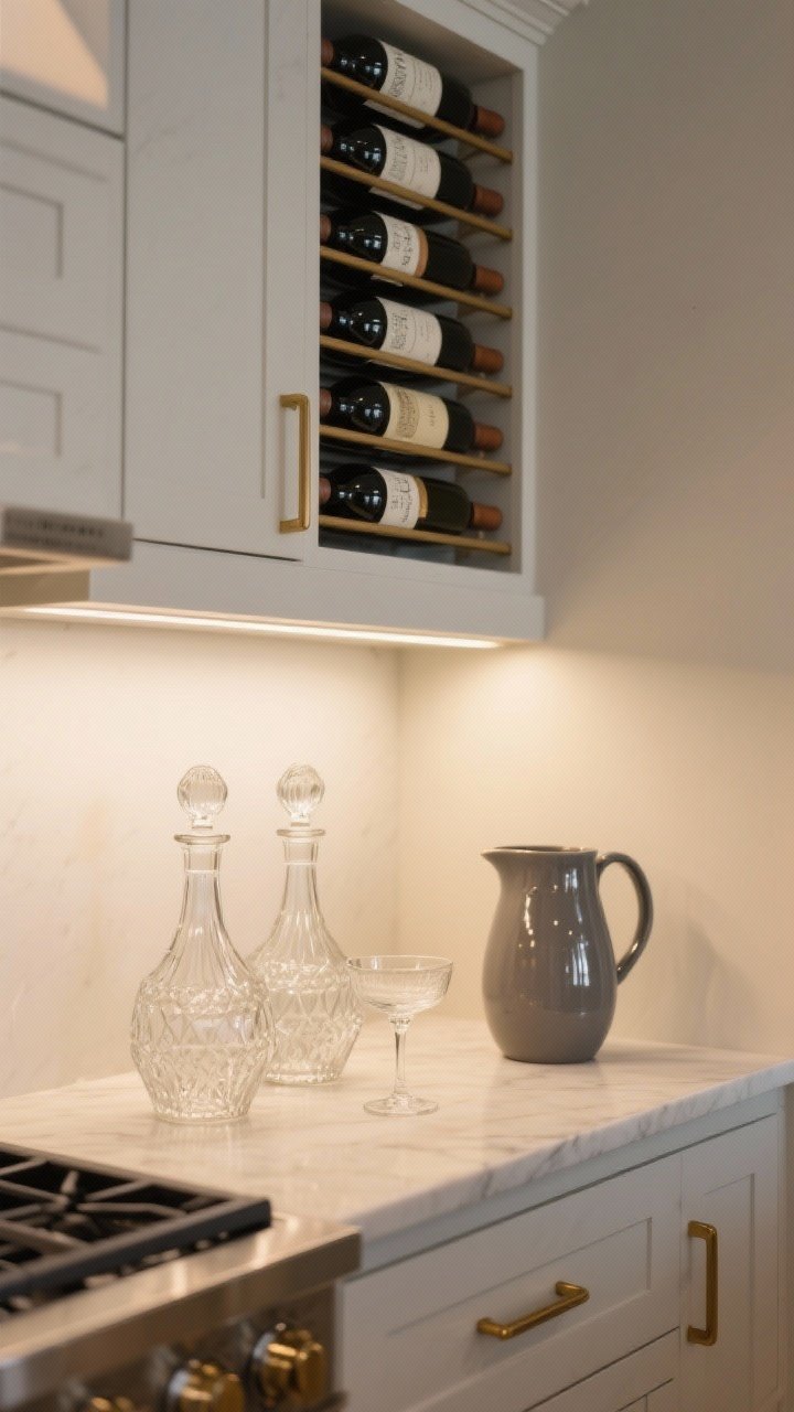
If you love hosting, turn that dead space into a chic bar-lite moment. Think sculptural wine racks, pretty decanters, and vintage coupe glasses that deserve to be seen.
How to pull it off
- Horizontal storage: Wine bottles look neater on low-profile racks that keep labels facing out.
- Add shine: A few metallic accents (brass, chrome) catch the light and elevate the whole look.
- Balance it out: Mix glass with matte elements (like ceramic pitchers) so it’s not too reflective.
Heads up: Avoid extreme heat zones. If your range vents up, keep bottles a safe distance away.
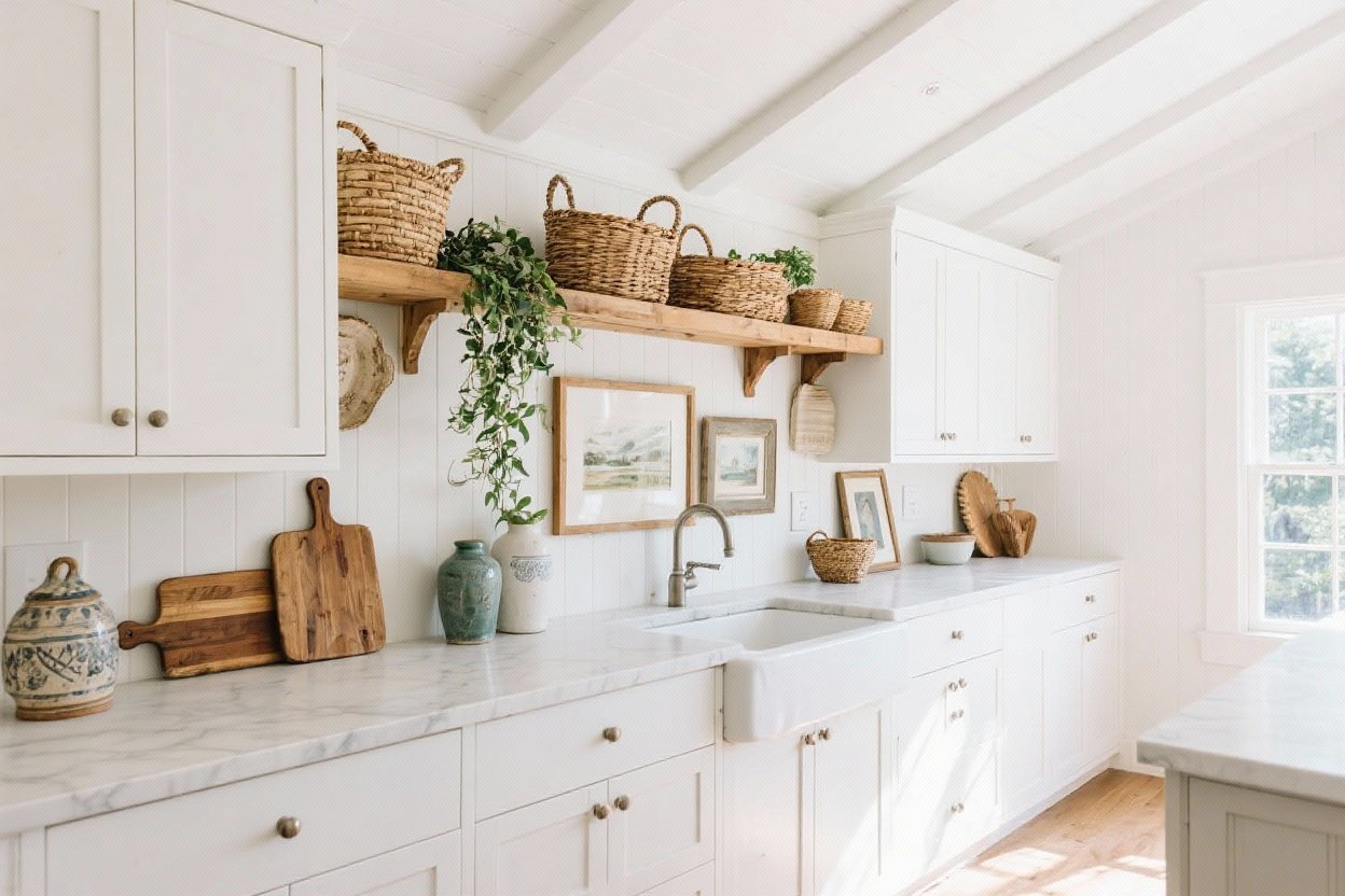
5. Layer Vintage Finds Like A Collector

There’s nothing like a lineup of thrifted treasures to make a kitchen feel unique. Old bread boards, copper pots, ceramic jugs, or antique scales bring warmth and patina you just can’t fake.
How to pull it off
- Stick to a palette: Earth tones and warm metals play nicely together and won’t feel chaotic.
- Vary shapes: Round boards, tall jugs, and a squat crock = visual rhythm.
- Tell a story: Mix pieces from different eras but keep one unifying detail—like wood tone or glaze color.
IMO: One oversized vintage piece can be more striking than seven small trinkets. Edit ruthlessly.
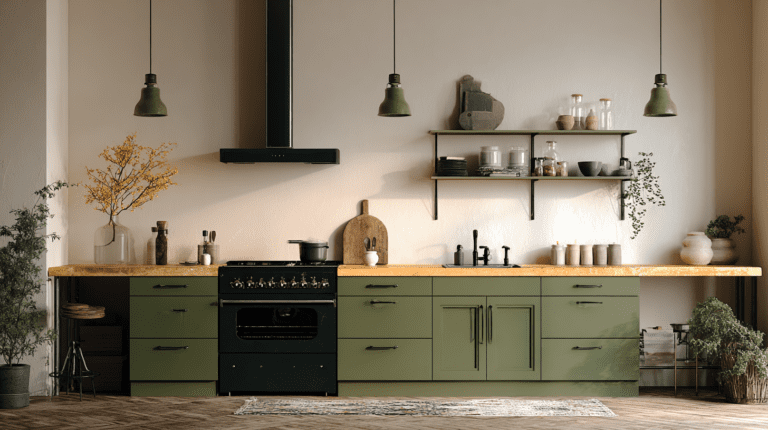
6. Embrace Architectural Elements For Instant Drama
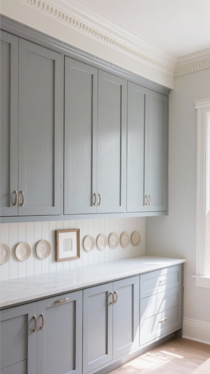
Faux beams, crown moulding, or even a slim ledge can make the space above your cabinets look finished instead of forgotten. It’s the difference between “builder basic” and “custom kitchen.”
How to pull it off
- Add a paint-matched riser: A simple painted box above the cabinets eliminates dust traps and elevates the whole profile.
- Install a shallow shelf: A 3–4 inch ledge lets you layer plates or frames without crowding.
- Consider beadboard or shiplap: A textured backdrop instantly ups the charm factor.
Pro tip: Paint the wall above the cabinets the same color as the cabinets to visually extend their height. Chef’s kiss.
7. Make It Seasonal Without Going Full Holiday Explosion
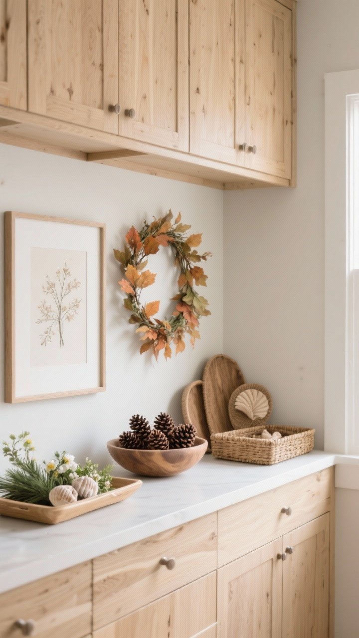
Rotate this space with subtle seasonal tweaks. You’ll get that fresh look without dragging bins across the house. Think fall foliage, winter greenery, spring florals, summer shells—light touches that nod to the season.
How to pull it off
- Keep the base neutral: Use baskets, trays, and art as your constants.
- Swap accents: Add small garlands, a bowl of pinecones, or a summery ceramic jug.
- Use modular pieces: Pick decor you can move around easily—no climbing gear required.
FYI: Stick to one or two seasonal colors so your kitchen still feels cohesive with the rest of your home.
8. Showcase Everyday Cookware Like Sculpture
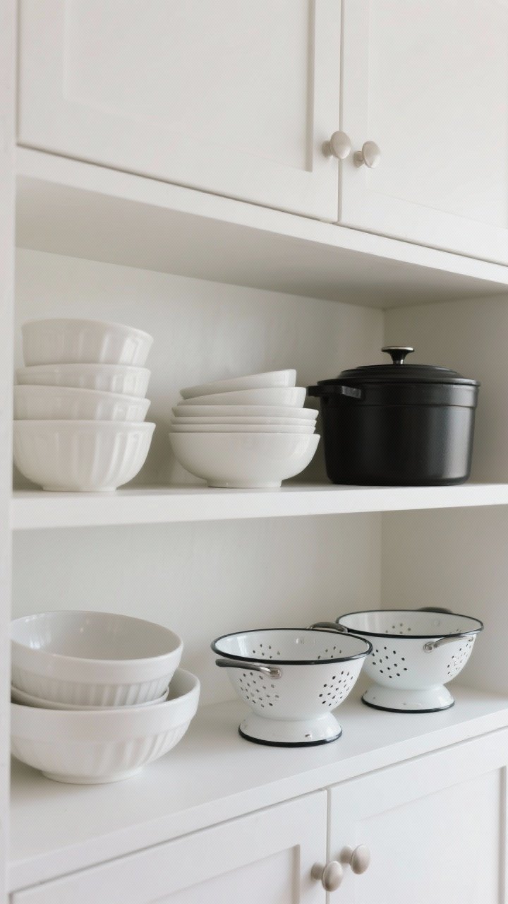
If you have gorgeous cookware, let it shine. Stacks of neutral mixing bowls, matte Dutch ovens, or a set of enamel colanders can feel intentional and artsy—without screaming “storage overflow.”
How to pull it off
- Group by material: All white ceramics, all copper, or all cast iron reads clean and curated.
- Stack strategically: Heavier pieces at the back, lighter or decorative items up front.
- Mind the gap: Leave a little air between groupings so it doesn’t look like a stockroom.
Reality check: If you actually use these pieces weekly, store only the extras up top to avoid constant ladder time.
9. Add Soft Lighting For That Restaurant Glow
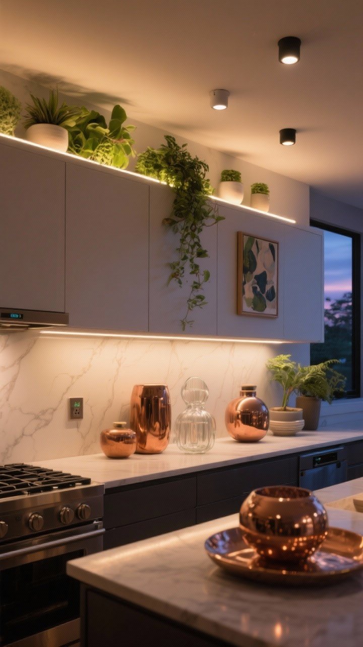
Lighting completely changes the vibe. A top row of warm LEDs or a few battery-powered spotlights can turn simple decor into a moment. It’s the easiest way to make your kitchen look designer at night.
How to pull it off
- Choose warm temps: 2700–3000K keeps everything cozy and flattering.
- Hide the hardware: Stick-on LED strips or puck lights tucked behind greenery or art work wonders.
- Add a smart plug: Set a schedule so the glow clicks on at dusk—hands-free magic.
Bonus: Light bouncing off copper, glass, or glossy ceramics adds instant depth and drama.
10. Curate A Color Story That Connects The Whole Room
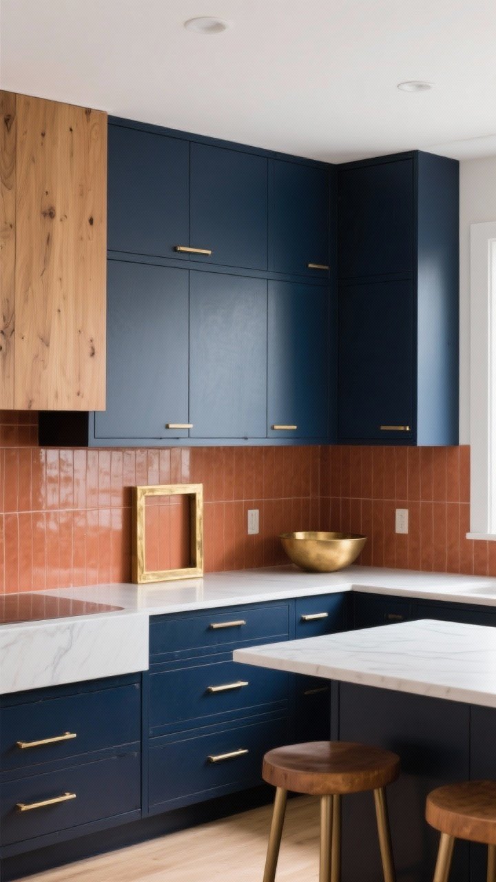
Even the best decor falls flat without a cohesive palette. Tie your above-cabinet styling back to your backsplash, island stools, or rug so it looks intentional—not like a random shelf in the sky.
How to pull it off
- Pick 3–4 colors: A dominant neutral (white, wood, or black), one main accent, and one metallic.
- Repeat finishes: If your hardware is brass, echo it with a brass frame or bowl up top.
- Layer tones: Mix light, medium, and dark shades for dimension without chaos.
Quick win: If your kitchen skews cool (grays, blues), choose silvery accents; for warm (beiges, terracotta), lean into brass and warm woods.
Practical Styling Tips That Work Across All Ideas
- Measure first: Know your gap height so you don’t buy pieces that barely peek over the cabinet line.
- Think triangles: Arrange tall-medium-short groupings to guide the eye and avoid the “flat line” look.
- Mind the maintenance: Choose wipeable surfaces, and dust with a microfiber mop head once a month.
- Edit, then edit again: If you wouldn’t notice it from across the room, it’s probably too small.
Bottom line: that space above your kitchen cabinets is a styling goldmine—not a graveyard for old gadgets. Whether you go lush with greenery, dramatic with art, or practical with baskets, pick a concept, repeat key elements, and keep it cohesive. Your kitchen’s about to level up—no renovation required.