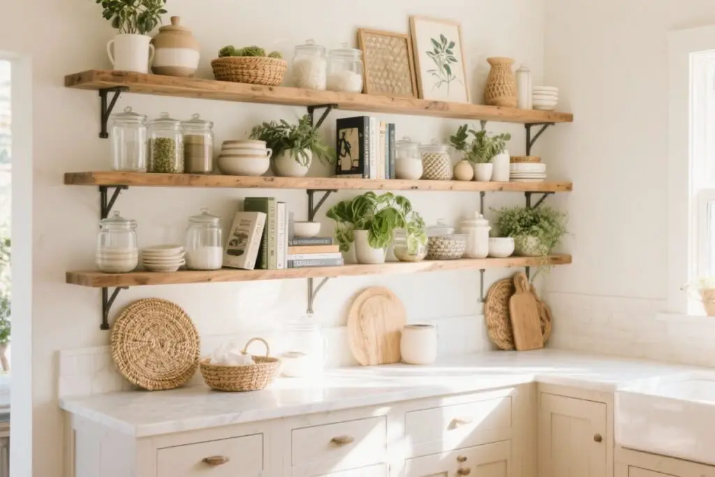

Your kitchen shelves aren’t just storage—they’re prime real estate for style. If you’ve been staring at those planks wondering why they look blah, I’ve got you.
Let’s turn them into mini galleries that feel curated, lived-in, and chef-approved.
We’re talking balance, texture, and personality—without sacrificing function. Ready?
1. Curate A Color Story (No, You Don’t Need A Degree)
Start with a simple palette. Pick two main colors and one accent. That’s it. Keeping a tight color story makes everything look intentional—even if you literally just tossed a bowl up there five minutes ago.
How To Pull It Off
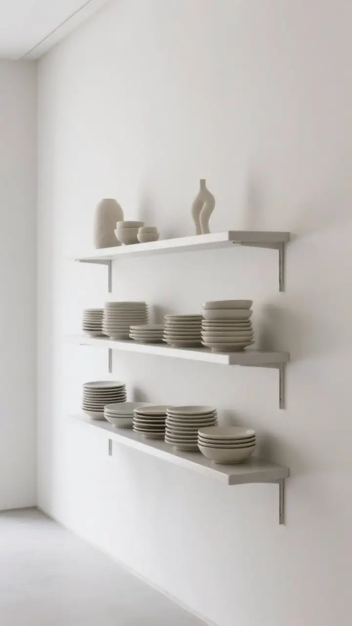
- Anchor with neutrals: White, cream, black, wood tones. These calm the eye.
- Add a punch: Think terracotta, sage, or navy. A single bold hue keeps things cohesive.
- Repeat strategically: If you have a sage mug on the left, add a sage cookbook or bowl on the right.
Pro tip: If your dishes are mismatched, group by color instead of style. Suddenly it looks curated, not chaotic.
2. Mix Open And Closed Storage (Hide The Chaos, Flaunt The Pretty)
Not everything deserves the spotlight. Use a combo of lidded containers, boxes, and baskets to tuck away the ugly stuff, and display the pieces you actually like.
Smart Moves
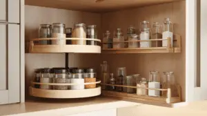
- Closed for clutter: Tea bags, packets, kid snacks—hide them in woven baskets or ceramic canisters.
- Open for show: Stack plates, display pretty glassware, or line up your favorite mugs.
- Vary heights: Stagger tall jars with low bowls to avoid a flat skyline.
FYI: Closed storage makes daily life faster and keeps shelves from looking like a pantry exploded.
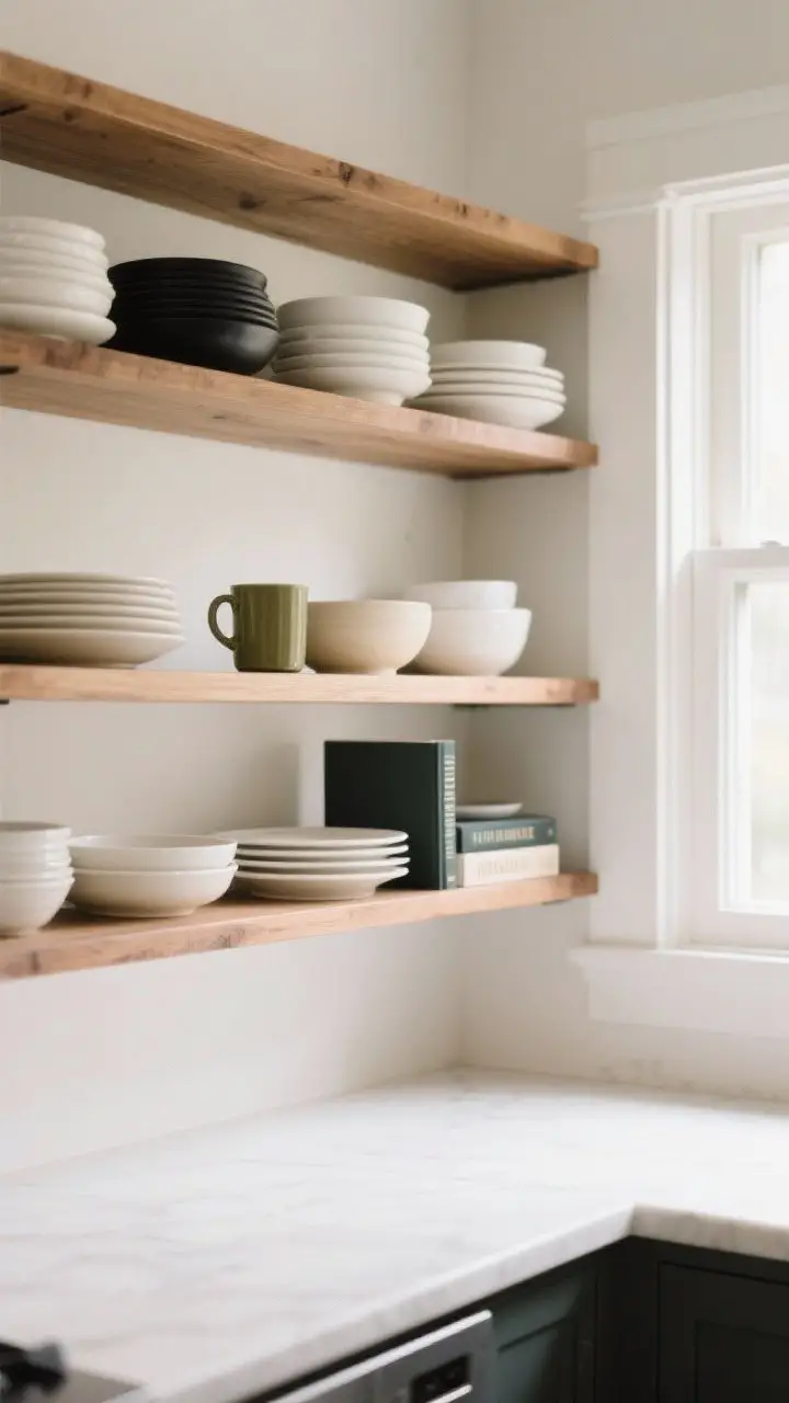
3. Play With Height And Scale Like A Stylist
Your shelves need rhythm. Mix tall items, mid-sized pieces, and small accents so your eye naturally travels across the whole display.
Try This Formula
- Rule of thirds: Create mini groupings of 3 items—one tall, one medium, one small.
- Stack books flat: Use cookbooks as risers for bowls or a small plant.
- Lean a board: Prop a cutting board or framed art in the back for height and dimension.
Think of it like a skyline—peaks and valleys keep things interesting.
4. Style With Everyday Essentials (Useful Can Be Beautiful)
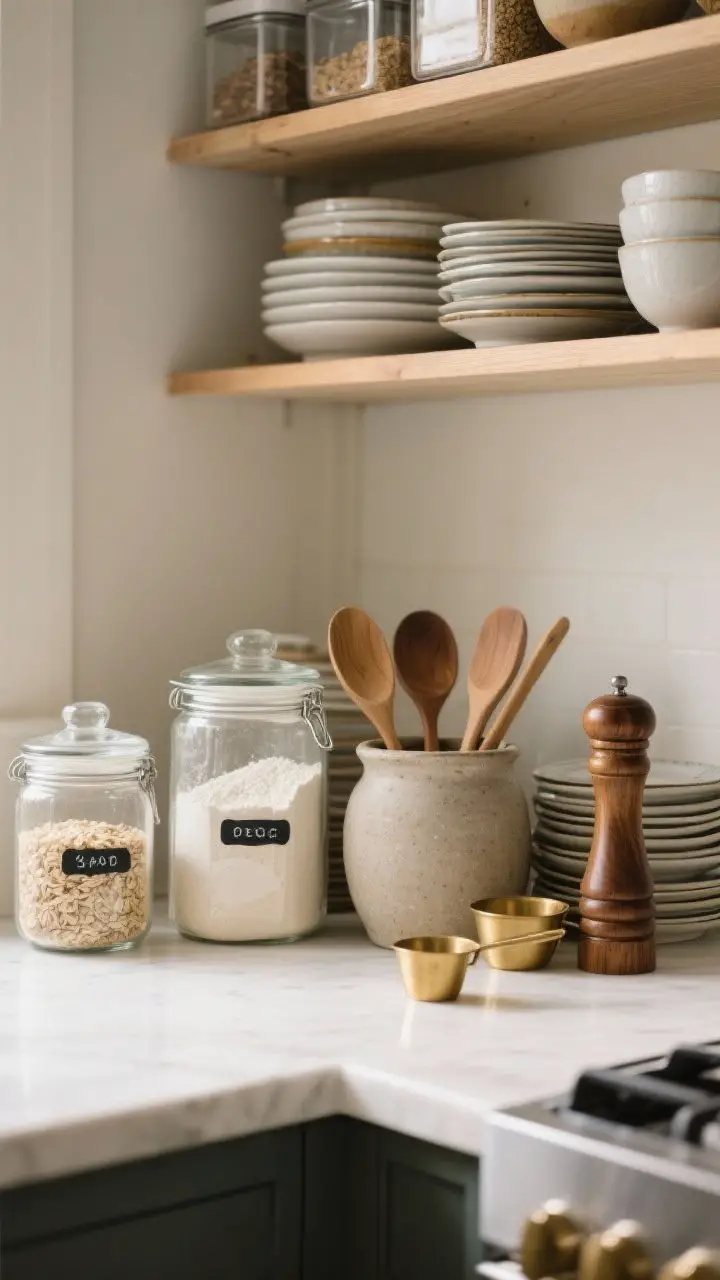
You’re using this stuff daily, so let it earn its shelf space. When basics look good, your whole kitchen feels designed without trying hard.
Functional And Cute
- Decant pantry staples: Flour, rice, and oats in glass or ceramic jars = instant beauty.
- Show off the good tools: Wooden spoons in a stoneware crock, brass measuring cups, a pretty pepper mill.
- Stack your favorites: Plates and bowls in neat piles look clean and ready for action.
Bonus: Transparent containers mean you actually know when you’re out of coffee. Practical magic.
5. Add Greenery For Instant Life (Plants Make Everything Hotter)
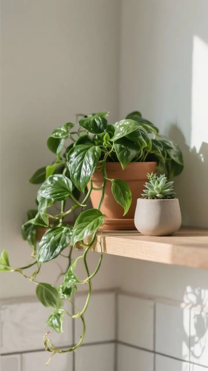
Shelves love a little green. Plants soften all those hard surfaces and bring movement and texture.
Low-Maintenance Favorites
- Pothos or philodendron: Trailing vines that look lush and forgive neglect.
- Herbs you’ll actually use: Basil, rosemary, mint. Hello, functional beauty.
- Succulents: If light is limited or you’re “forgetful,” they’ll survive.
Not into plants? Try faux stems in a ceramic jug. No judgment—nobody’s checking.
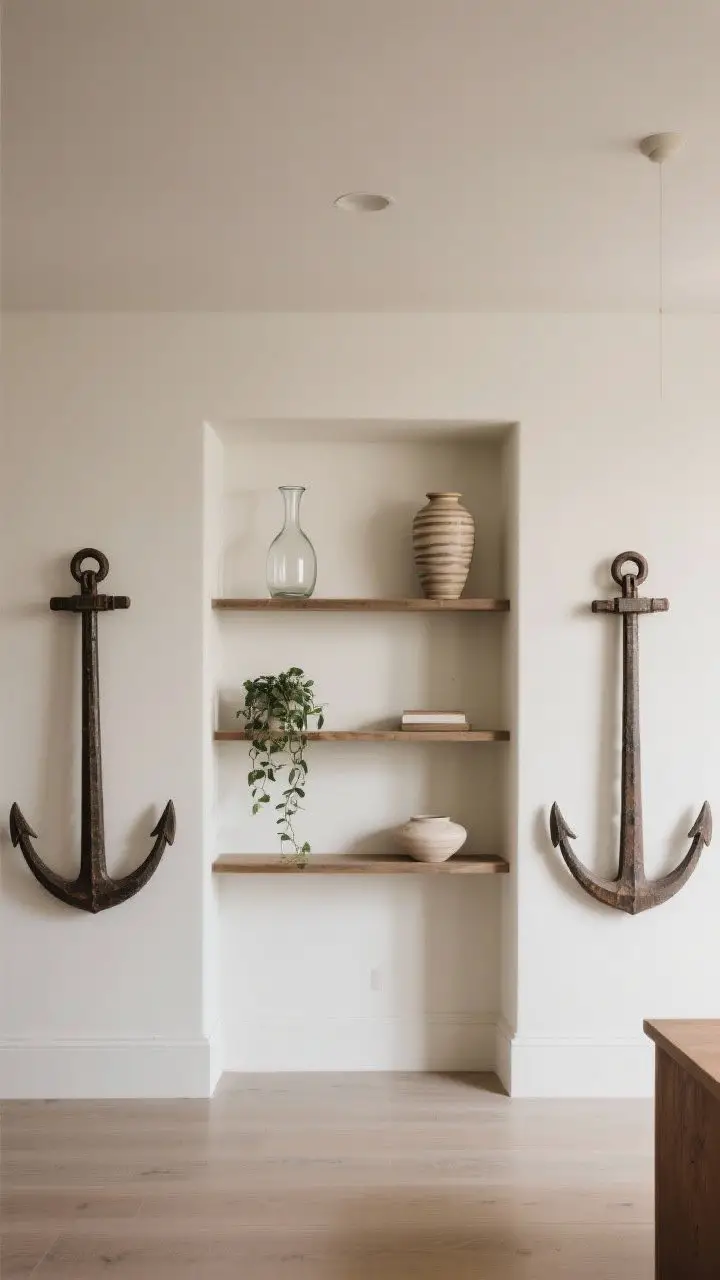
6. Layer Art And Boards For Depth (Flat Shelves Are Boring)
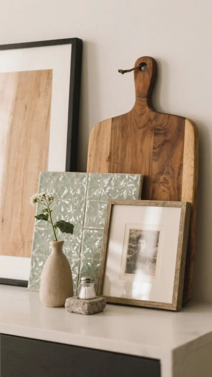
Leaning objects instantly add dimension. A simple framed print or a glazed tile can be the difference between “meh” and “wow.”
Easy Layering Ideas
- Start with a backdrop: Lean a cutting board or tray against the wall.
- Add a print: Pop in small framed art, a vintage photo, or a recipe card.
- Finish with a small object: A bud vase or salt cellar in front completes the vignette.
Keep frames simple and water-resistant if they’re near steaming pots. Steam + paper = sadness.
7. Embrace Texture Like A Designer
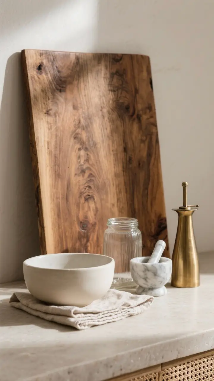
Texture is your secret sauce. Pair glossy with matte, smooth with woven, metal with wood. Contrast makes everything feel intentional.
Texture Combos That Just Work
- Wood + ceramic: Warm and cool materials balance each other.
- Glass + linen: Airy and soft—perfect for summer vibes.
- Stone + metal: Marble mortar and pestle next to a brass oil cruet? Chic.
Use repetition in texture to unify: three wood elements across two shelves will tie the look together.
8. Create Mini “Stations” (Zones = Sanity)
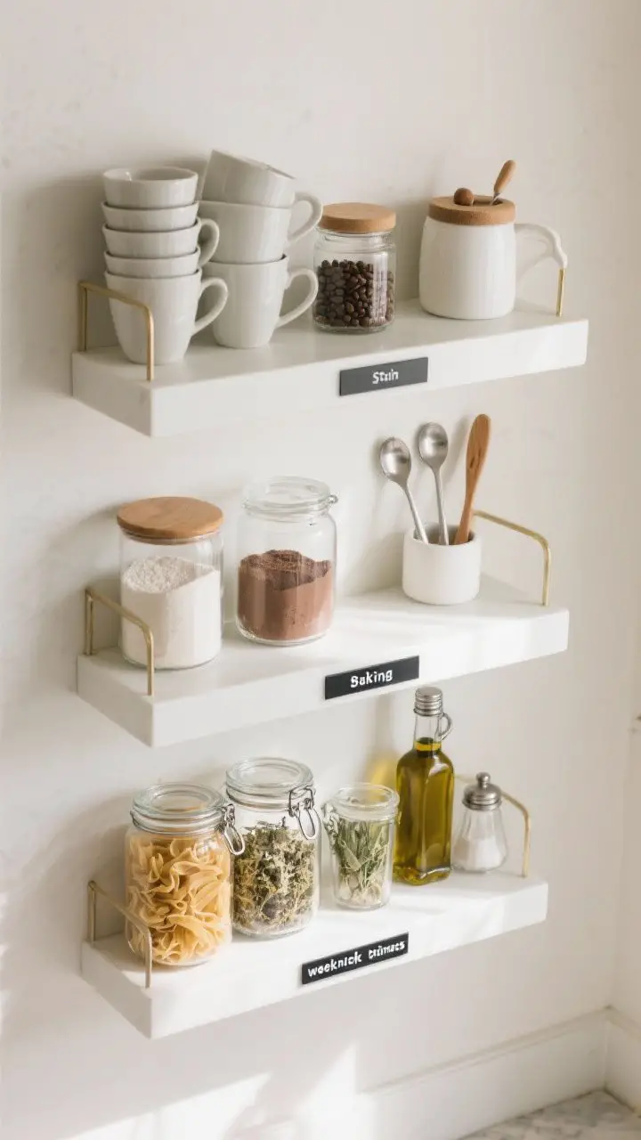
Organize decor by purpose so your shelves look styled but also work hard. Treat them like little stations that make life easier.
Station Ideas
- Coffee corner: Mugs, sugar, espresso cups, a small jar of beans, and a spoon rest.
- Baking zone: Flour, sugar, cocoa, measuring spoons, and a cute sifter.
- Weeknight dinners: Pasta jars, salt cellar, olive oil, and dried herbs within reach.
Label discreetly if you share the kitchen. It looks chic and prevents “Where’s the cinnamon?” interrogations.
9. Go Symmetrical—Then Break The Rules
Symmetry calms the brain. Start with a balanced layout, then add one or two “rule breakers” so it doesn’t feel stiff.
How To Balance
- Match the anchors: Put tall items on both ends of a shelf.
- Mirror shapes, not items: A carafe on one side, a tall vase on the other. Coordinated, not copy-paste.
- Break the line: A trailing plant or uniquely shaped piece keeps it from feeling too perfect.
Perfect symmetry is great for photos. Real life needs a dash of personality.
10. Style With Seasons (Low Effort, High Impact)
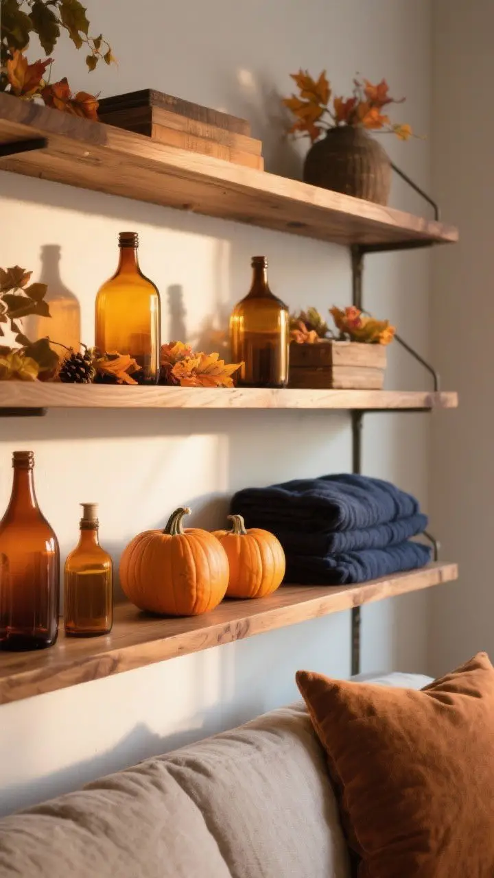
Seasonal tweaks keep shelves feeling fresh without a full overhaul. Swap a few accents and call it a day.
Quick Swaps
- Spring: Citrus in a bowl, fresh herbs, pastel textiles.
- Summer: Clear glassware, woven baskets, bright napkins.
- Fall: Amber bottles, wood tones, a small pumpkin or two.
- Winter: Candles, evergreen sprigs, deep hues like navy or oxblood.
Keep a small “seasonal stash” in a box so changing things takes five minutes, tops.
11. Showcase A Collection (But Edit, Edit, Edit)
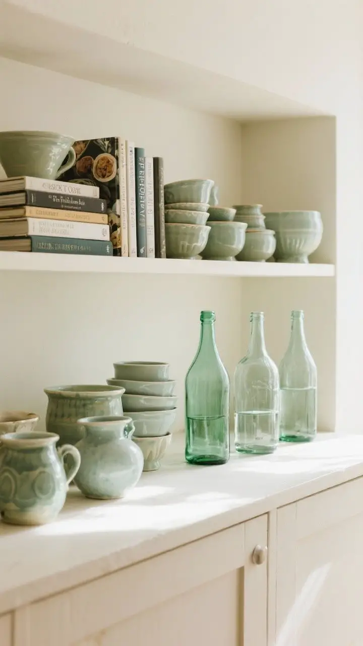
Collections look best when they’re edited. Pick your favorites and give them breathing room. The goal: charming, not cluttered.
What To Collect
- Vintage ceramics: Mismatched but within a color family = swoon.
- Cookbooks: Stack horizontally and vertically for interest.
- Glass bottles or jars: Clear, amber, or green grouped by tone.
Display in odd numbers and vary heights. If it’s starting to look like a yard sale, pull a few pieces off.
12. Use Negative Space Like A Pro
Yes, you can leave space. White space lets statement pieces breathe and makes shelves feel curated, not cramped.
Where To Hold Back
- Edges and corners: Leave a few inches open to avoid a crowded feel.
- Between stacks: Give your bowls and plates a little elbow room.
- Top shelves: Keep it lighter up high—visually and literally.
IMO, nothing screams “designer” like restraint. Let the eye rest.
13. Add Softness With Textiles (Yes, On Shelves)
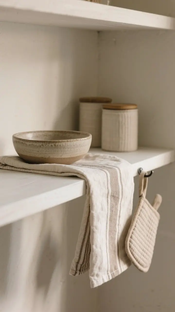
Textiles aren’t just for chairs. Fold a linen tea towel, drape a napkin under a bowl, or tuck a small runner under a vignette for softness.
Textiles That Elevate
- Linen or cotton napkins: Neutral or striped, casually folded.
- Mini runners: A narrow fabric strip under canisters adds subtle texture.
- Potholders or oven mitts: Hang one neatly from a small hook under the shelf.
Stick to durable, washable fabrics. Kitchens are, um, saucy places.
14. Add Personality With Unexpected Objects
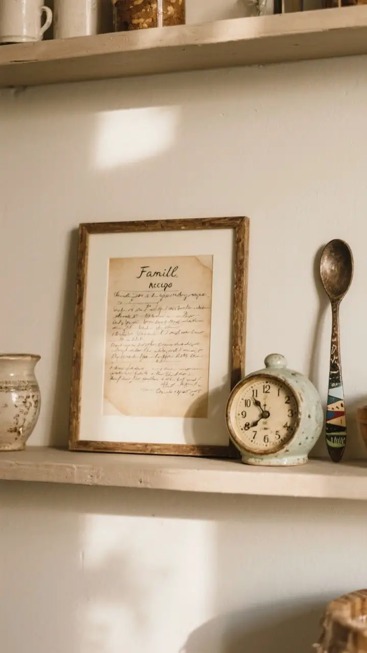
Bring in little curveballs that feel like you. A travel mug, a tiny sculpture, a quirky salt pig, or a vintage clock. These pieces tell your story.
Ideas That Spark Joy
- Family mementos: A handwritten recipe card in a frame—instant heart-eyes.
- Travel finds: A ceramic dish from a market or a handmade spoon.
- Small art or typography: A cheeky quote or classic print for charm.
Just one or two “unexpected” pieces per shelf is enough. We love interesting, not random.
Quick Styling Checklist
- Choose a color palette and repeat it.
- Balance heights, textures, and shapes.
- Mix open + closed storage for function and style.
- Add greenery and a bit of art for personality.
- Leave negative space. Edit once more before you’re done.
Here’s your permission slip: move things around until it clicks. Shelf styling is like outfit planning—you’ll know when it feels right. Have fun, trust your eye, and don’t be afraid to break a “rule” if it looks good. Your kitchen, your vibe.