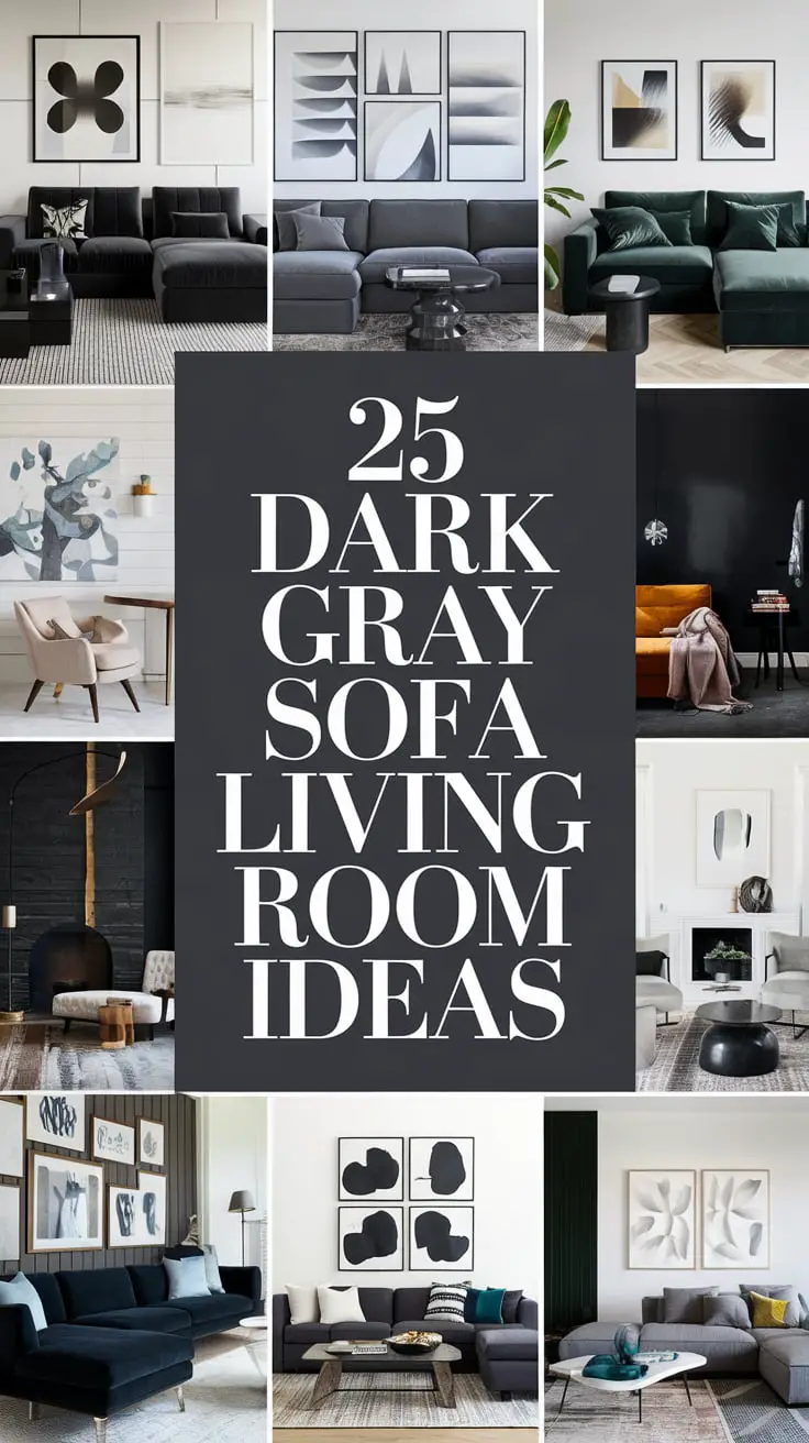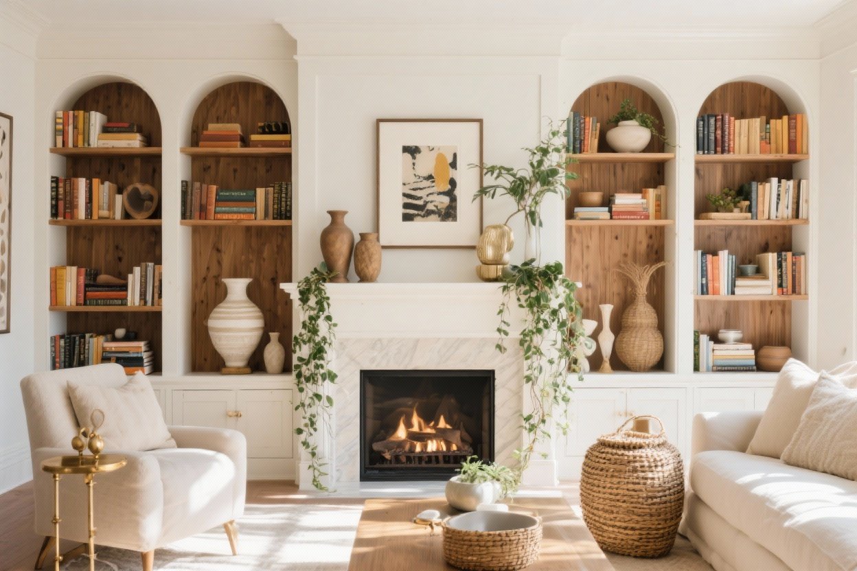
15 Built-in Bookshelf Styling Ideas That Instantly Look Designer
You’ve got built-ins—aka the stage where your books, art, and random treasures can finally shine. But styling them so they feel curated and not chaotic?
That’s the tricky part. Don’t worry—I’ve got 15 foolproof ideas to make your shelves look like they were styled by a pro (without actually hiring one).
1. Start With a Clean Slate (Then Add Back Intentionally)
Take everything off. Yes, everything. You can’t style on top of a mess. Wipe the shelves, patch scuffs, and decide on a vibe: airy and minimal, collected and cozy, color-forward, or neutral with texture.
Then “shop” your house. Pull in books, art, bowls, candles, boxes, interesting objects—whatever tells your story. Your shelves should feel like you, not like a catalog spread that forgot you live there.
- Pro tip: Start with larger anchor pieces to avoid clutter fatigue later.
- Edit often: If you love everything, it means you need to edit more.
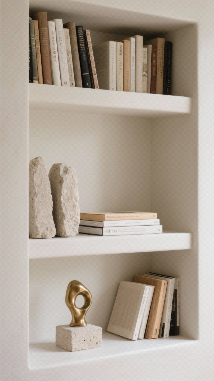
2. Create Visual Triangles (Your Secret Styling Formula)
When in doubt, build triangles. Group objects in odd numbers (3, 5, 7) and arrange them at staggered heights so your eye moves around the shelf. It’s the simplest way to make things look balanced without being boring.
Use books to lift smaller objects, stack a bowl on top, then flank with a taller vase. Hello, pleasing geometry.
- High–medium–low: One tall object, one medium, one low = instant harmony.
- Mix shapes: Round + linear + organic prevents everything from feeling stiff.
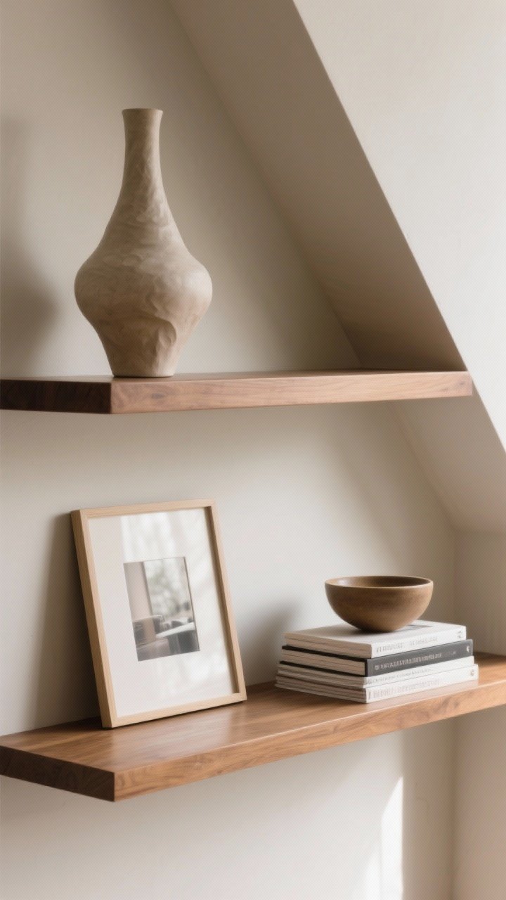
3. Mix Vertical, Horizontal, and Leaning Books
Books are the backbone (pun intended). But all vertical spines? Snooze. Vary it. Stand some books up, stack some horizontally, and lean a few against a bookend or frame.
It adds rhythm and makes your collection feel collected, not dumped.
- Stacks do double duty: Use them as mini pedestals for a candle or small sculpture.
- Spine styling: Turn spines inward for a softer, tonal look (controversial, FYI).
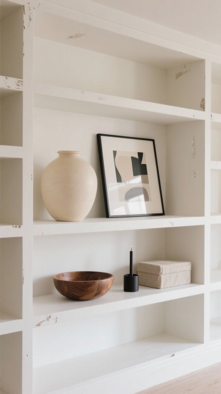
4. Layer Art and Frames Behind Objects
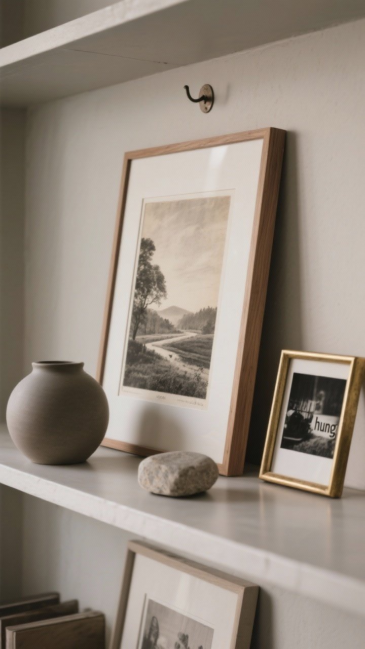
Art on bookshelves is underrated. Lean frames at the back of shelves to create depth, then layer objects in front. It’s like a tiny gallery moment.
Mix sizes—one larger frame off-center with a smaller print overlapping works wonders. Black-and-white photography? Chic. Vintage landscapes? Cozy. Kids’ art? Adorable and personal.
- Stick-on hooks: Use them on the back panel for a hung look without drilling.
- Frame variety: Black, brass, wood—mix, but keep it to 2–3 finishes total.
5. Go Monochrome for Major Impact
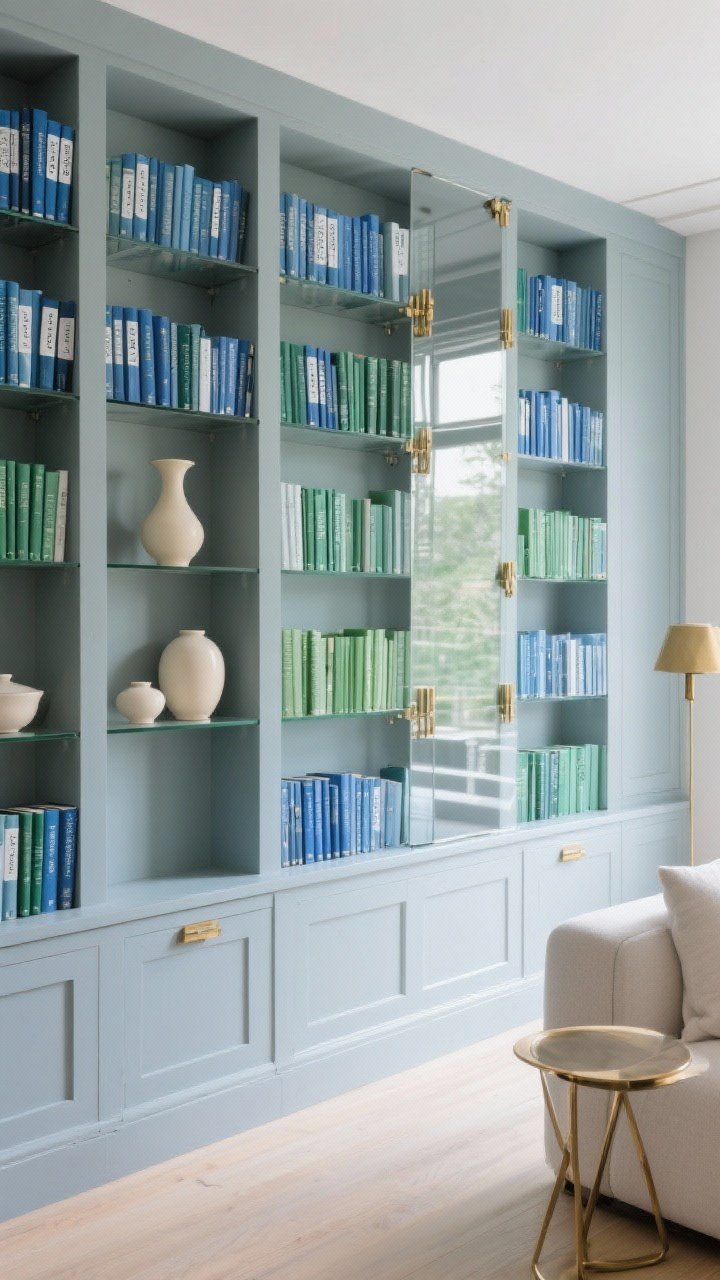
Pick a color story and commit. All neutral spines with cream ceramics. Or blues and greens with glass and brass. A focused palette reads calm and curated, especially in open-plan spaces.
Not into matchy-matchy? Try tonal layers instead: warm woods, linen, stone, and woven textures in varying shades.
- Pro move: Wrap dust jackets in kraft or white paper and label the spines for a clean look.
- Edit accents: One contrasting color pops more than five competing ones.
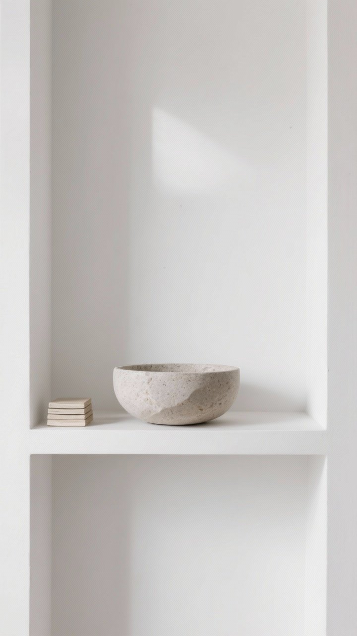
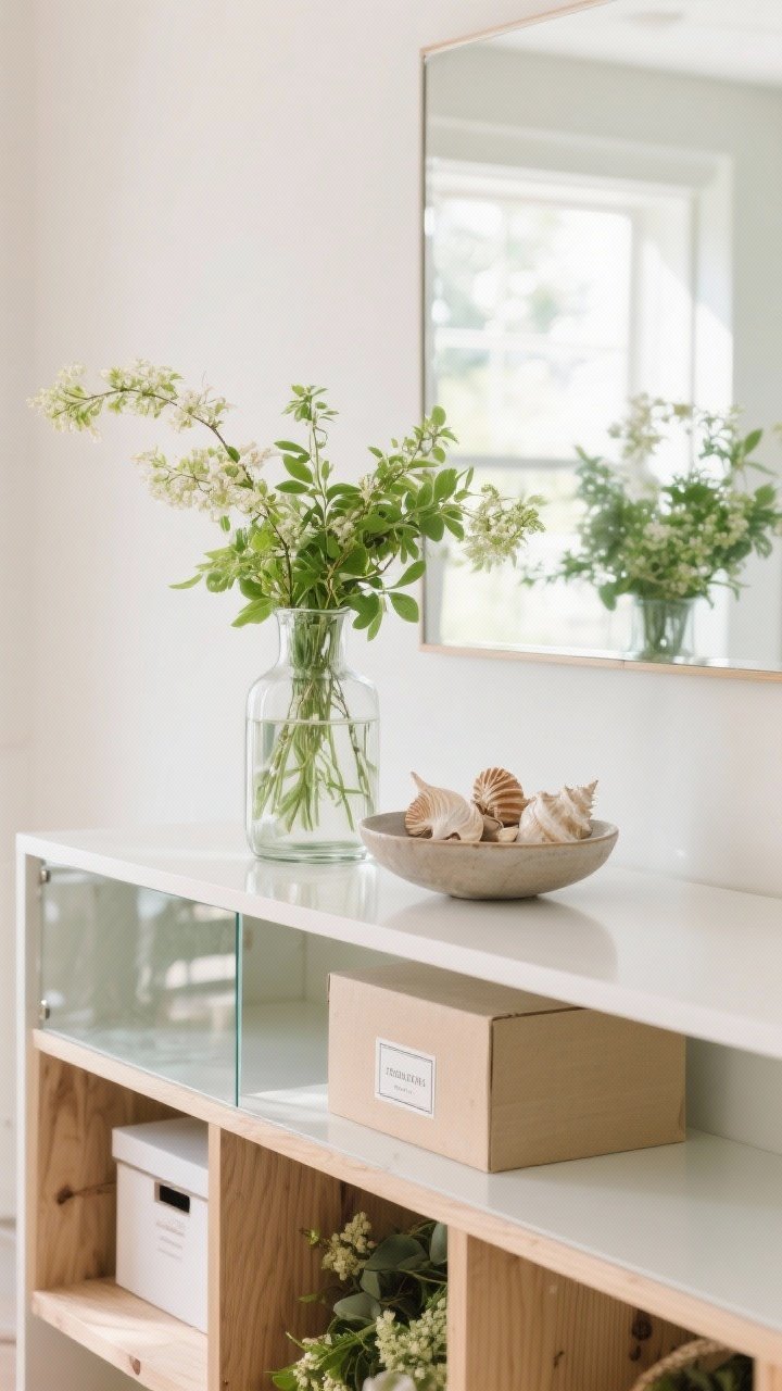
6. Add Texture: Ceramics, Woven Baskets, and Natural Elements
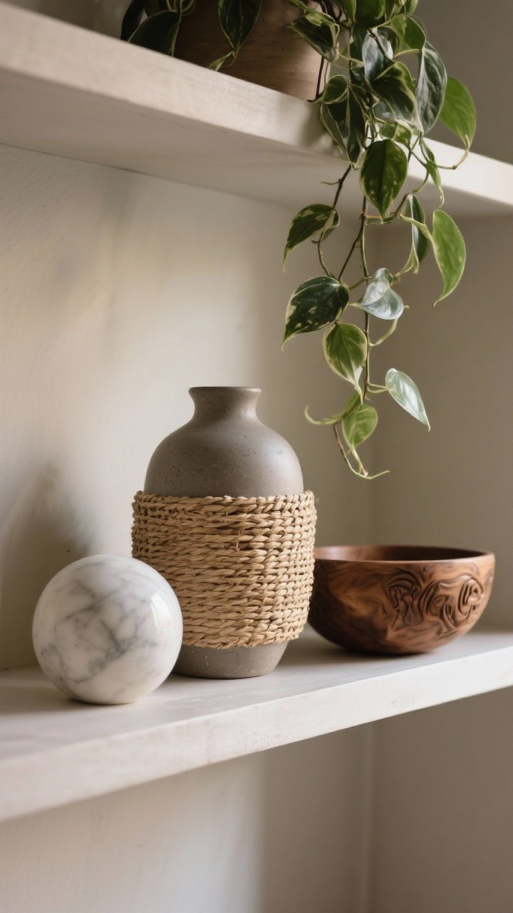
Texture is the shortcut to “I hired a stylist.” Mix matte ceramics with woven baskets, wood bowls, stone objects, and a trailing plant. Shelves go from flat to layered instantly.
Don’t be afraid of tactile pieces: a rough vase, a cane box, a marble sphere—it’s all about contrast.
- Natural duo: One leafy plant + one woven piece per bay feels balanced, not boho overload.
- Finish mix: Matte + glossy + raw = chef’s kiss.
7. Style by Shelf: Heavy to Light
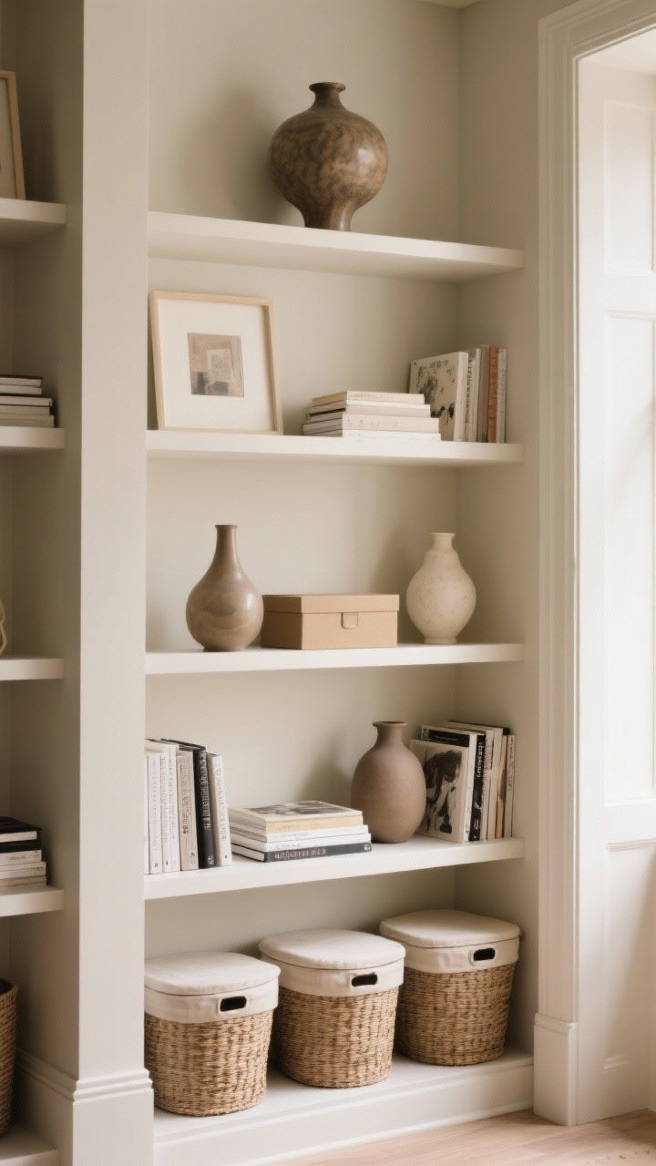
Weight distribution matters. Place larger, heavier pieces (thick books, big vases, boxes) on lower shelves. As you go up, lighten it with smaller stacks, airy frames, and delicate objects.
This not only looks intentional—it keeps things from visually “toppling.” Your eyes will thank you.
- Ground the bottom: Use storage baskets or larger lidded boxes low for practicality.
- Keep the top breezy: One statement piece beats six small tchotchkes.
8. Use Negative Space Like a Designer
Empty space is not a mistake. It’s breathing room. Give your best pieces a little stage by leaving space around them. Less clutter = more impact.
If every shelf is stuffed, nothing stands out. Edit until you feel slightly uncomfortable, then stop. That’s the sweet spot.
- Rule of thirds: Fill about two-thirds of a shelf, leave one-third open.
- Spotlight moments: One sculptural bowl centered on a shelf = calm, luxe energy.
9. Add Subtle Symmetry (Without Going Formal)
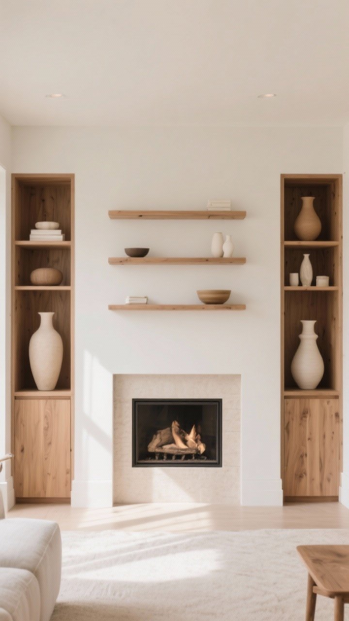
Symmetry makes built-ins feel tidy, but perfect mirror images can feel stiff. Aim for “cousins,” not twins. Similar shapes and heights across shelves give cohesion without feeling overplanned.
Think: two medium vases on opposite sides, not identical clones. Matchy vibes, relaxed execution.
- Anchor the ends: Place taller items at the outer edges to frame the whole unit.
- Center calm: Keep middle shelves slightly simpler to avoid visual noise.
10. Bring in Bookends and Boxes (Form + Function)
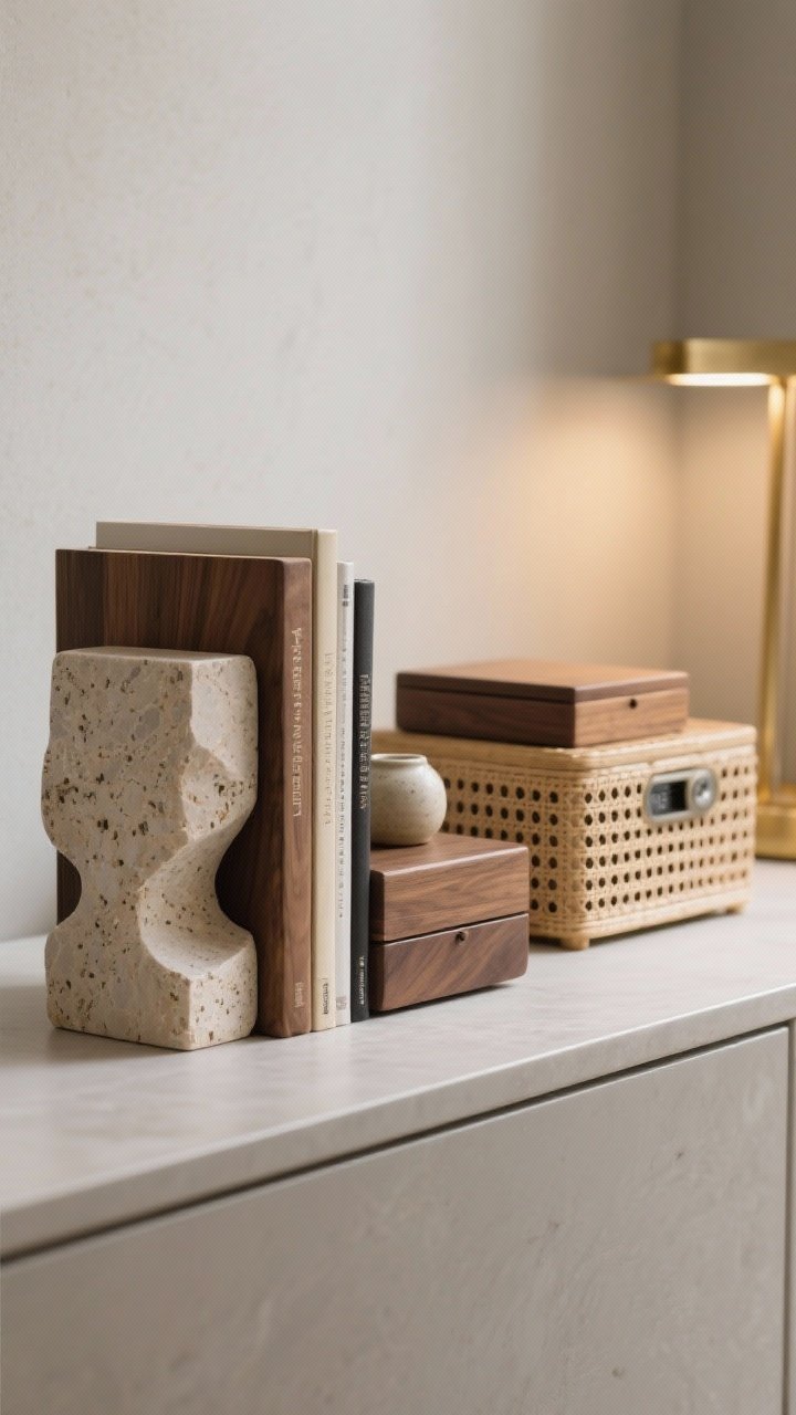
Useful can be beautiful. Bookends keep vertical rows neat and look sculptural. Boxes hide remotes, cords, and other gremlins. Win-win.
Pick materials that echo your palette: stone for cool neutrals, wood for warmth, brass for glam, matte black for modern edge.
- Height hack: Stack two slim boxes to lift a smaller object to eye level.
- Disguise tech: Corral routers or hubs behind a perforated rattan box for airflow.
11. Layer Lighting: Sconces, Picture Lights, and Shelf Lamps
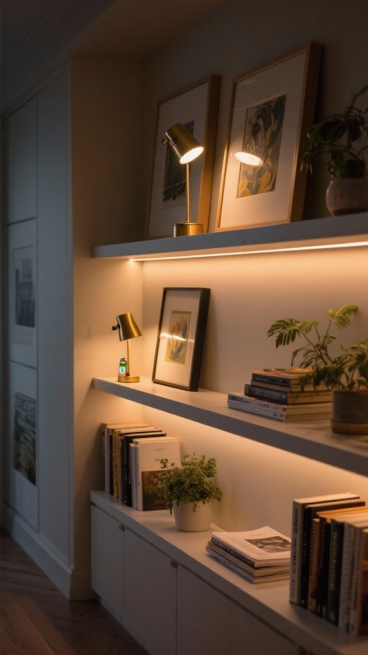
Lighting turns good styling into great styling. If your built-ins can handle it, add picture lights or small sconces above. No hardwiring? Tiny accent lamps or rechargeable puck lights under shelves are gold.
Warm light = cozy. Harsh white = dental office. Choose wisely.
- Backlight glow: LED strips on the underside of shelves create a soft wash.
- Safety note: Keep lights away from plant leaves and paper edges, obviously.
12. Curate a Few Conversation Pieces
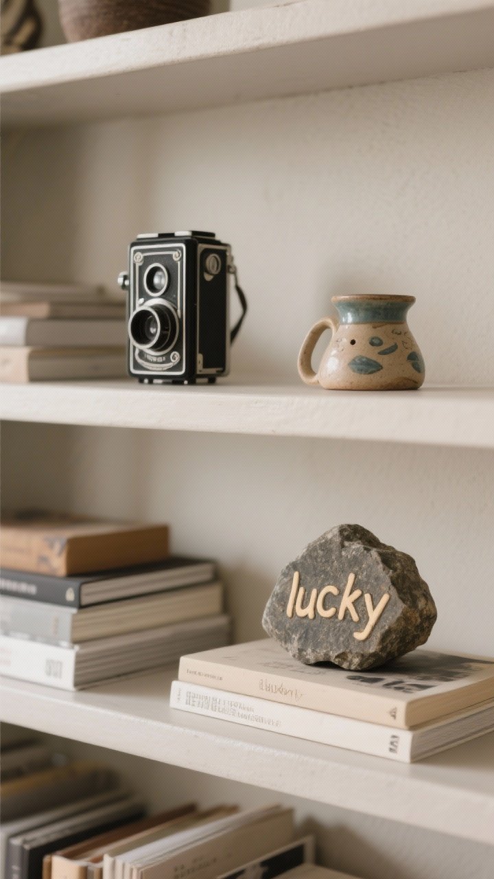
Give your shelves personality. A vintage camera, a ceramic you picked up on vacation, a weirdly cool rock your kid insists is “lucky”—these are the pieces that make your shelves feel lived-in.
Just don’t turn it into a flea market. One conversation piece per shelf is plenty.
- Story matters: If a guest asks, you should have a fun one-liner ready.
- Mix eras: Old + new creates tension (the good kind).
13. Style With Height Changes and Risers
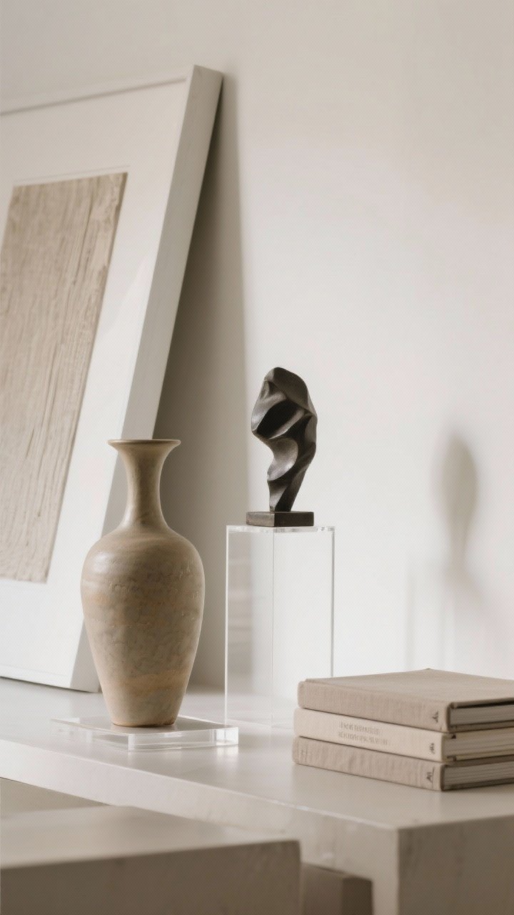
Height = drama. If your objects all sit at the same level, everything looks flat. Use risers, stacked books, or discreet acrylic stands to create elevation and layers.
A tall vase next to a low stack, with a mid-height sculpture bridging the gap? Chef’s kiss.
- DIY risers: Hidden wood blocks, inverted bowls, or clear stands work wonders.
- Mind sightlines: Don’t block art with objects—overlap without hiding.
14. Seasonal Swaps Without the Overhaul
Rotate a few items seasonally to keep things fresh (and to flex your styling skills, IMO). In spring, swap in greenery and glass. Summer: shells, lighter woods. Fall: moody art and brass. Winter: candles and richer textures.
Keep your core layout and just change accents. It’s the minimal-effort refresh your shelves deserve.
- Store smart: Keep seasonal items together in a labeled box so swaps take 10 minutes.
- Fresh stems: One small bouquet or clipping wakes the whole vignette up.
15. Give Each Bay a Theme (Soft, Not Literal)
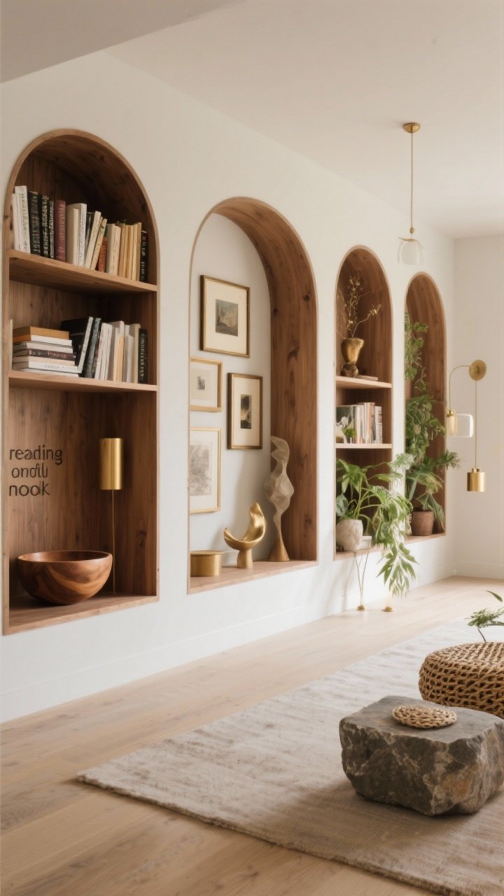
If you’ve got multiple built-ins, assign a soft theme to each column or bay to avoid a jumbled look. One could lean “reading nook” with mostly books and a bowl. Another “artful” with frames and sculptural pieces. Another “organic” with plants and raw textures.
It keeps things cohesive but interesting—like a curated exhibit instead of a storage unit.
- Thread the needle: Repeat 1–2 elements (color, material, shape) across all bays for unity.
- Stand back test: Take a photo from across the room. Anything shouting? Edit it.
Quick Styling Checklist
- Balance: Heavy low, light high, and visual weight distributed left to right.
- Variety: Mix vertical/horizontal books, shapes, textures, and heights.
- Negative space: Leave breathing room so heroes can shine.
- Cohesion: Keep to a tight color palette and 2–3 finishes.
- Personality: Add conversation pieces and meaningful art.
- Lighting: Warm, layered light for evening glow.
Common Mistakes to Avoid
- Overstuffing: If it looks like a bookstore sale bin, take 30% off. Literally.
- Tiny clutter: A million small objects read messy. Group or elevate them.
- Same-height syndrome: No variation? No depth. Add risers and tall pieces.
- Ignoring backdrop: Dark paint or wallpaper behind shelves adds drama—worth it.
You don’t need to buy a single new thing to make your built-ins look amazing (though, if a new ceramic falls into your cart, I won’t judge). Start with what you have, edit boldly, and play until it feels right. You’ll know when you hit that sweet spot where everything looks collected, calm, and very you.
Now go pour a coffee, put on a playlist, and style those shelves. Your future self—and your Zoom background—will thank you.